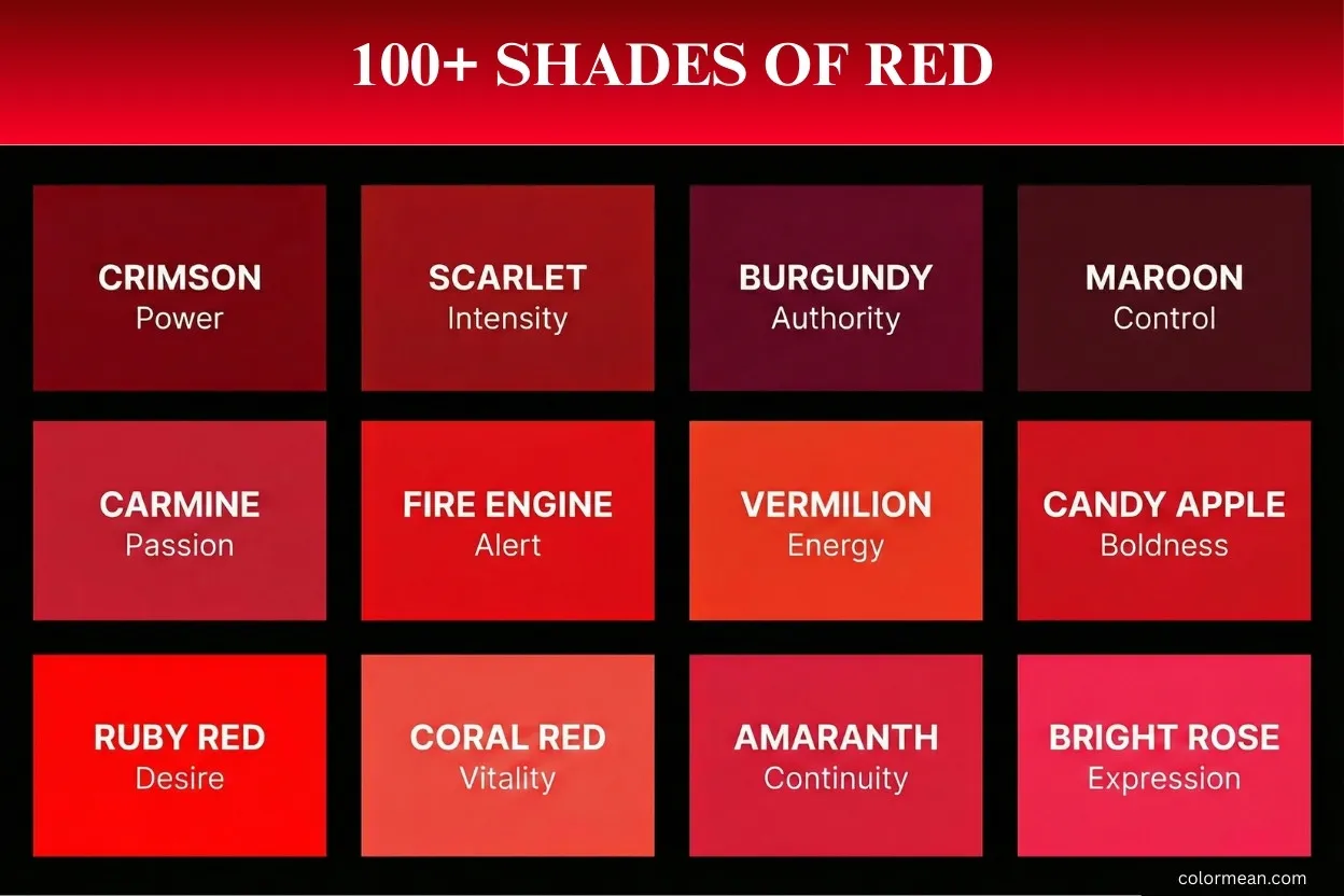
Red is more than just a color. It carries energy, passion, and meaning. In this post, you will explore over 100 shades of red. From bright crimson to deep garnet, each shade tells its own story.
We include hex, RGB, and CMYK codes for every color. You will also learn the meaning and use of each shade. This makes it easy to pick the right red for design, art, or decoration.
By the end of this guide, you will know how each red looks, feels, and works. You can quickly identify the perfect shade for your project.
Let’s dive into the vibrant world of red shades.
Light Salmon Pink
Light Salmon Pink is a gentle, warm pastel derived from the hue of salmon flesh. Historically, it’s a modern, desaturated variant of classic salmon, popular in mid-20th century design for its softness. Interestingly, this color evokes comfort and is often used in nursery decor and spring fashion. It carries meanings of tender warmth and playful innocence. Consequently, Light Salmon Pink is widely used in web design for buttons, cosmetics packaging, and interior accents to create a soothing, inviting atmosphere.
- HEX: #FF9999
- RGB: 255, 153, 153
- CMYK: 0, 40, 40, 0
Pastel Red
Pastel Red is a softened, muted red with significant white added. It emerged from the broader pastel movement in art and fashion, gaining prominence for its less aggressive quality than pure red. A key fact: it’s often called “coral pastel” for its warm, pinkish-orange undertone. This color symbolizes gentle love, subtle energy, and approachable passion. Therefore, Pastel Red is strategically used in children’s products, health-themed marketing, and user interface elements where a friendly, low-alarm cue is needed.
- HEX: #FF6961
- RGB: 255, 105, 97
- CMYK: 0, 59, 62, 0
Melon
Melon is a very pale, pinkish-orange shade directly named after the flesh of a cantaloupe. It became a distinct color name in the late 19th century with the standardization of crayons and paints. Notably, it sits on the border between pink and orange, making it uniquely versatile. This hue represents sweetness, freshness, and summery vibrancy. As a result, Melon is frequently applied in summer fashion lines, refreshing beverage branding, and spa or wellness interiors to promote a sense of clean, fruity vitality.
- HEX: #FEBAAD
- RGB: 254, 186, 173
- CMYK: 0, 27, 32, 0
Tea Rose
Tea Rose is a grayish, dusty pink inspired by the pale cultivar of the rose flower. It was a highly fashionable color in the Victorian era, especially in fabrics and wallpaper. Interestingly, it is one of the first colors to be called “rose” without being vividly red. This color conveys nostalgic romance, quiet femininity, and understated elegance. Thus, Tea Rose is a staple in vintage-themed designs, wedding stationery, and luxurious lingerie, often paired with deeper tones for a classic, sophisticated feel.
- HEX: #F4C2C2
- RGB: 244, 194, 194
- CMYK: 0, 20, 20, 4
Spanish Pink
Spanish Pink is a light, warm pink with a subtle peachy influence. Its name suggests a cultural association with traditional Spanish aesthetics, though it’s a modern color term. A fascinating detail: it has an almost imperceptible coolness compared to pure light pink, giving it sophisticated depth. This shade signifies warm hospitality, soft passion, and Mediterranean warmth. Consequently, Spanish Pink is utilized in hospitality design, cosmetic blushes, and textile patterns to inject a sun-kissed, welcoming glow.
- HEX: #F7BFBE
- RGB: 247, 191, 190
- CMYK: 0, 23, 23, 3
Vivid Tangerine
Vivid Tangerine is a bright, saturated blend of orange and pink, named after the tangerine fruit. It became iconic in the 1960s and 70s for its bold, psychedelic energy. Importantly, it’s significantly brighter and warmer than a standard peach. This color radiates enthusiasm, creativity, and youthful exuberance. Therefore, Vivid Tangerine is powerful in sports apparel, attention-grabbing advertisements, and contemporary art to convey unapologetic fun and dynamic motion.
- HEX: #FF9980
- RGB: 255, 153, 128
- CMYK: 0, 40, 50, 0
Salmon
Salmon is a medium pink-orange hue directly mimicking the color of wild salmon flesh. It has been used as a color term since the late 18th century. A key fact: the web color “Salmon” is notably lighter and pinker than the actual flesh of most salmon species. This classic color represents health, nourishment, and natural vitality. As such, Salmon is pervasive in food industry logos, activewear, and website backgrounds where a friendly, appetizing, and energetic impression is desired.
- HEX: #FA8072
- RGB: 250, 128, 114
- CMYK: 0, 49, 54, 2
Coral Pink
Coral Pink is a brighter, more pink-dominated variant of coral. It draws its name from marine coral skeletons, becoming popular in the 1950s “Florida” aesthetic. Interestingly, it is often confused with salmon but is distinctly more pink and less orange. This hue evokes tropical warmth, playful charm, and sociable energy. Thus, Coral Pink is a favorite in resort wear, retro diner decor, and beauty product packaging to signal a cheerful, lively, and slightly nostalgic vibe.
- HEX: #F88379
- RGB: 248, 131, 121
- CMYK: 0, 47, 51, 3
Rosewater
Rosewater is an extremely pale, washed-out pink with a hint of peach, named after the fragrant byproduct of rose distillation. It surged in popularity as a “millennial pink” adjacent trend in the 2010s. Notably, it is a key color in the Pantone Color of the Year “Serenity” palette from 2016. This color embodies tranquility, modern wellness, and gentle self-care. Consequently, Rosewater is extensively used in skincare branding, minimalist interior design, and tech device finishes to promote a calm, clean, and modern aesthetic.
- HEX: #FFD6D1
- RGB: 255, 214, 209
- CMYK: 0, 16, 18, 0
Dusty Rose
Dusty Rose is a grayish, medium-toned pink that looks like rose pink mixed with ash. It was a defining color of the 1980s, especially in fashion and wedding themes. A fascinating detail: its “dustiness” comes from a significant addition of gray, which mutes its intensity. This shade communicates mature romance, understated grace, and vintage charm. Therefore, Dusty Rose is ideal for bridesmaid dresses, shabby chic decor, and mature branding where a soft, sophisticated, and non-flashy personality is key.
- HEX: #DCA1A1
- RGB: 220, 161, 161
- CMYK: 0, 27, 27, 14
Begonia
Begonia is a vibrant, saturated pink-red named after the flowering plant. It emerged as a distinct color in horticultural and design circles. Interestingly, it sits between coral and strawberry, possessing a unique fruity vibrancy. This color symbolizes lively energy, social engagement, and friendly warmth. Consequently, Begonia is effective in summer marketing campaigns, event graphics, and contemporary fashion to project a bold yet approachable personality.
- HEX: #FA7268
- RGB: 250, 114, 104
- CMYK: 0, 54, 58, 2
Sunset Orange
Sunset Orange captures the intense, warm glow of the sun at dusk. It’s a natural phenomenon color used for centuries in art. A key fact: it’s redder than a pure orange, embodying the day’s final fiery moments. This hue evokes dramatic beauty, wistful transition, and warm closure. Thus, Sunset Orange is powerful in travel and tourism branding, event posters, and sunset-themed artwork to inspire emotion and awe.
- HEX: #FA5F55
- RGB: 250, 95, 85
- CMYK: 0, 62, 66, 2
Terra Cotta
Terra Cotta is an earthy, brownish-orange directly named after “baked earth” clay used for pottery for millennia. Historically, it’s one of the oldest man-made colors, seen in ancient artifacts worldwide. Notably, its tone varies with the iron content of the local clay. This color represents craftsmanship, natural warmth, and organic stability. Therefore, Terra Cotta is foundational in bohemian and rustic design, artisanal product packaging, and warm-neutral interior schemes.
- HEX: #E3735E
- RGB: 227, 115, 94
- CMYK: 0, 49, 59, 11
Persimmon
Persimmon is a pure, vivid orange-red named after the ripe fruit. It became a standard color name with the spread of the fruit in the West. Interestingly, it is almost identical to the safety color “International Orange”. This bold color signifies vibrant health, exotic sweetness, and unmistakable visibility. As a result, Persimmon is used for high-visibility safety gear, fruit juice branding, and accent walls to command immediate attention.
- HEX: #EC5800
- RGB: 236, 88, 0
- CMYK: 0, 63, 100, 7
Vermilion
Vermilion is a brilliant red-orange with a historic pigment made from toxic mercuric sulfide. It was prized in ancient China, Rome, and Renaissance Europe for its intensity. Crucially, it was often the color of choice for important manuscripts and art. Vermilion symbolizes luck, prosperity, and immortality in Asian cultures, and power in the West. Thus, it’s used in traditional lacquerware, ceremonial art, and as a classic, vibrant accent in design.
- HEX: #E34234
- RGB: 227, 66, 52
- CMYK: 0, 71, 77, 11
Coral Red
Coral Red is a bright, electric red with a subtle orange influence. It’s a digital-era color, taking its name from sea coral but achieving a more neon-like purity on screens. A fascinating point: it’s a web color with a defined hexadecimal value. This hue communicates urgent energy, digital friendliness, and playful alertness. Consequently, Coral Red is ideal for online call-to-action buttons, game graphics, and modern logo accents where it needs to stand out without seeming aggressive.
- HEX: #FF4040
- RGB: 255, 64, 64
- CMYK: 0, 75, 75, 0
Tomato
Tomato is a warm, medium red explicitly named after the common fruit. It became a standard web color, offering a softer alternative to pure red. Importantly, it’s less orange than coral but brighter than brick red. This color suggests freshness, heartiness, and approachable boldness. Therefore, Tomato is widely used in food industry visuals, kitchen product design, and friendly warning icons to feel energetic yet familiar.
- HEX: #FF6347
- RGB: 255, 99, 71
- CMYK: 0, 61, 72, 0
Poppy
Poppy is a rich, saturated orange-red inspired by the common poppy flower. It gained symbolic weight after World War I, representing remembrance. A key fact: it is slightly darker and richer than pure orange-red. This hue carries meanings of sleep, peace, death, and also vibrant life. As such, Poppy is used in memorial imagery, folk art patterns, and fall fashion to convey deep, warm intensity.
- HEX: #E35335
- RGB: 227, 83, 53
- CMYK: 0, 63, 77, 11
Coquelicot
Coquelicot is the French word for poppy, denoting a pure, fiery red-orange. It was a fashionable import in English during the 18th and 19th centuries. Interestingly, its name is considered exotically stylish in color nomenclature. This color exudes continental flair, artistic boldness, and uncompromising vibrancy. Thus, Coquelicot appears in high-fashion textiles, artistic posters, and luxury branding to signal sophisticated heat.
- HEX: #FF3800
- RGB: 255, 56, 0
- CMYK: 0, 78, 100, 0
Scarlet
Scarlet is a vivid, slightly orange-tinted red with a long history tied to expensive dye. Originally made from kermes insects, it was a color of wealth, power, and the church. Notably, it is often associated with sin and ceremony simultaneously. This powerful color symbolizes passion, courage, and warning. Consequently, Scarlet is used for cardinals’ robes, academic regalia, sports cars, and critical alerts, embodying ultimate visibility and importance.
- HEX: #FF2400
- RGB: 255, 36, 0
- CMYK: 0, 86, 100, 0
Imperial Red
Imperial Red is a vivid, cool-toned red with a slight blue undertone. Its name directly evokes power, royalty, and empire, historically linked to European heraldry and military uniforms. A key fact: it is very close to the red on the flag of the former British Empire. This color represents authority, ambition, and formal dignity. Therefore, Imperial Red is used in government insignia, luxury branding, and formal accessories to convey commanding presence and traditional prestige.
- HEX: #ED2939
- RGB: 237, 41, 57
- CMYK: 0, 83, 76, 7
Amaranth Red
Amaranth Red is a bright, pinkish-red named after the amaranth flower, which symbolizes immortality in Greek mythology. The color rose to prominence in the Art Deco period for its modern vibrancy. Interestingly, it is clearer and pinker than crimson. This hue carries meanings of enduring love, unfading beauty, and vibrant life. Consequently, Amaranth Red is popular in floral patterns, festive decorations, and youth-oriented marketing to express joyful passion.
- HEX: #F4364C
- RGB: 244, 54, 76
- CMYK: 0, 78, 69, 4
Rose Madder
Rose Madder is a rich, transparent red derived from the madder plant root, a natural dye used since antiquity. It was a crucial pigment for Renaissance and Baroque artists for glazing. Importantly, it is cooler and more purple than many reds. This color historically signifies wealth, artistic mastery, and depth. Thus, Rose Madder is employed in fine art reproduction, historical fashion design, and upscale packaging to impart a sense of heritage and luscious depth.
- HEX: #E32636
- RGB: 227, 38, 54
- CMYK: 0, 83, 76, 11
Madder Lake
Madder Lake is a deep, slightly brownish red also from the madder plant, but processed into a more permanent “lake” pigment. It was a staple on artists’ palettes before synthetic reds. A fascinating detail: its brown undertone gives it an earthy, aged quality. This shade evokes antiquity, warmth, and organic richness. As a result, Madder Lake is ideal for restoration work, rustic interiors, and autumn-themed designs to create a comfortable, timeworn atmosphere.
- HEX: #CC3336
- RGB: 204, 51, 54
- CMYK: 0, 75, 74, 20
Alizarin Crimson
Alizarin Crimson is a deep, cool, transparent red and the synthetic 19th-century replacement for rose madder. Its invention was a major breakthrough in chemistry and art. Notably, it is nearly identical to Rose Madder in hue but more lightfast and consistent. This pigment symbolizes modern innovation, dramatic intensity, and cool passion. Therefore, it remains a fundamental paint on every artist’s palette and is used in design for striking, cool-toned accents and shadow effects.
- HEX: #E32636
- RGB: 227, 38, 54
- CMYK: 0, 83, 76, 11
Crimson
Crimson is a strong, bright deep red with a slight blue bias, originally from the kermes insect dye. The name is derived from the Sanskrit for “worm-produced.” It has long been associated with cardinals, nobility, and academia. This color conveys elevated passion, grandeur, and solemnity. Consequently, Crimson is iconic for ivy league universities, ceremonial robes, and luxury velvets, representing a classic, powerful red.
- HEX: #DC143C
- RGB: 220, 20, 60
- CMYK: 0, 91, 73, 14
Cinnabar
Cinnabar is a vivid red-orange named after the mercury sulfide mineral, ground to make the original vermilion pigment. It was highly valued in ancient China and the Americas for ritual use. Interestingly, the mineral is toxic, adding dangerous allure to its history. This color represents transformation, spiritual energy, and bold statement. Thus, Cinnabar is used in Asian-inspired art and decor, statement jewelry, and energetic branding to project unmissable vibrancy.
- HEX: #E84B3D
- RGB: 232, 75, 61
- CMYK: 0, 68, 74, 9
Razzmatazz
Razzmatazz is a bold, pinkish-red invented by Crayola in 1993. The name suggests excitement, flashiness, and showmanship. It was originally called “Hot Magenta” before a contest renamed it. This synthetic color embodies 1990s pop culture, electric energy, and playful boldness. Therefore, Razzmatazz is perfect for kids’ products, party supplies, and digital graphics aiming for a fun, loud, and contemporary feel.
- HEX: #E3256B
- RGB: 227, 37, 107
- CMYK: 0, 84, 53, 11
UA Red
UA Red is the official athletic color of the University of Alabama, a deep, cool crimson. It embodies school spirit, tradition, and competitive pride. The specific shade is trademarked and fiercely protected by the university. This color symbolizes team loyalty, historic legacy, and fierce determination. As a result, beyond collegiate use, it’s applied in sports branding, energetic promotions, and designs needing a communal, passionate red.
- HEX: #D9004C
- RGB: 217, 0, 76
- CMYK: 0, 100, 65, 15
Spanish Red
Spanish Red is a pure, intense red commonly associated with the national colors of Spain. It evokes flamenco, bullfighting, and national fiestas. This shade is warmer and brighter than many European flag reds. It communicates cultural pride, fiery emotion, and celebratory life. Consequently, Spanish Red is used in touristic marketing, cultural event graphics, and passionate branding to instantly convey a Mediterranean zest for life.
- HEX: #E60026
- RGB: 230, 0, 38
- CMYK: 0, 100, 83, 10
Carmine
Carmine is a deep, rich red with a blue undertone, made from the cochineal insect. This pigment was a prized export from the New World, rivaling gold in value for European artists and dyers. Its production was a closely guarded secret for centuries. This color symbolizes luxury, Renaissance artistry, and enduring depth. Therefore, Carmine is used in historical art restoration, high-end cosmetics (like lipstick), and gourmet food coloring to impart a classic, sumptuous richness.
- HEX: #960018
- RGB: 150, 0, 24
- CMYK: 0, 100, 84, 41
Electric Crimson
Electric Crimson is a blazing, neon-like red with a strong pink shift. It’s a modern, synthetic color born from digital design and fluorescent pigments. The name emphasizes its shocking, high-voltage intensity. This hue radiates extreme energy, digital rebellion, and futuristic speed. Consequently, Electric Crimson is a staple in nightclub graphics, cyberpunk aesthetics, and extreme sports branding to scream cutting-edge excitement.
- HEX: #FF003F
- RGB: 255, 0, 63
- CMYK: 0, 100, 75, 0
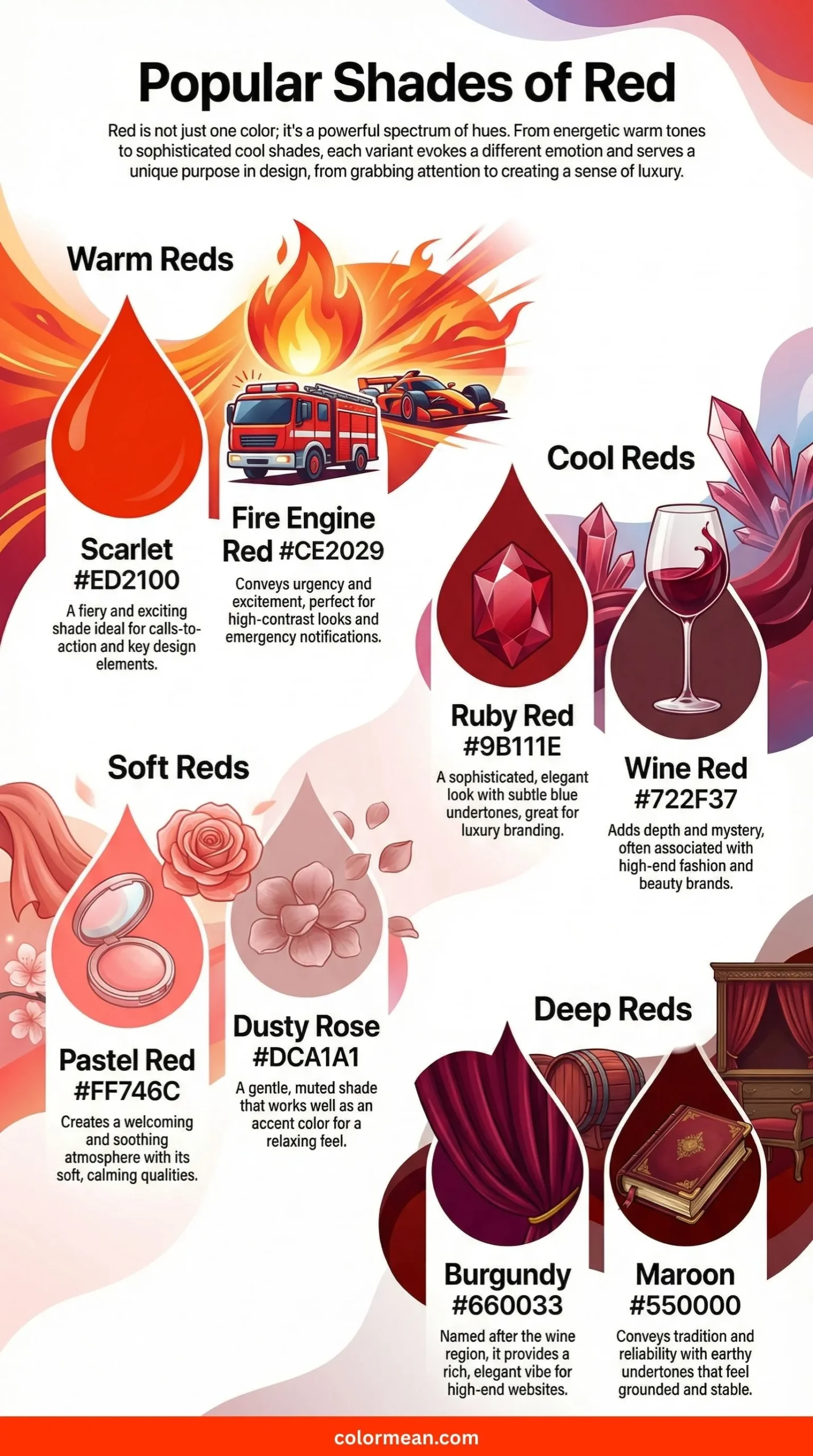
Fire Engine Red
Fire Engine Red is a vivid, slightly orange-red standardized for maximum visibility. Its association with emergency vehicles makes it instantly recognizable and urgent. Interestingly, some modern fire apparatus use other colors, but this shade remains iconic. This color universally signals danger, urgency, and immediate action. Thus, it’s crucial for safety equipment, stop signs, and critical warning labels, and is also used in retro design for its bold, Americana vibe.
- HEX: #CE2029
- RGB: 206, 32, 41
- CMYK: 0, 84, 80, 19
Candy Apple Red
Candy Apple Red is a high-gloss, saturated red that mimics the shiny coating of a candy apple. It became iconic in 1950s American hot rod culture. This color is all about surface sheen and pop culture nostalgia. It represents retro cool, speed, and indulgent sweetness. As a result, Candy Apple Red is synonymous with custom automotive paint, vintage appliances, and rockabilly fashion, embodying mid-century optimism and flashy style.
- HEX: #FF0800
- RGB: 255, 8, 0
- CMYK: 0, 97, 100, 0
International Orange
International Orange is a deep, reddish-orange defined for global visibility. It was famously used on the Golden Gate Bridge for both visibility and atmospheric blending. It’s also the color of NASA spacesuits. This shade is engineered for safety and recognition in vast spaces. Consequently, it’s used in aerospace, high-stakes engineering, and massive infrastructure where unmissable identification is paramount.
- HEX: #FF4F00
- RGB: 255, 79, 0
- CMYK: 0, 69, 100, 0
Munsell Red
Munsell Red is a precisely defined, vivid red from the Munsell Color System, a foundational scientific framework for describing color. It represents the prototypical “red” hue at maximum chroma in that system. This color is not about emotion but objective color science and standardization. Therefore, Munsell Red is a key reference in digital color calibration, product quality control, and artistic education to ensure accurate color communication.
- HEX: #F2003C
- RGB: 242, 0, 60
- CMYK: 0, 100, 75, 5
Upsdell Red
Upsdell Red is a dark, muted red with brown and gray undertones. It’s named after a person, giving it a more obscure, specific origin. This shade is less aggressive than a pure dark red, feeling earthy and subdued. It evokes rustic warmth, aged leather, and autumn foliage. Thus, Upsdell Red is effective in heritage branding, academic publishing, and cozy interior design where a quiet, dignified warmth is desired.
- HEX: #AE2029
- RGB: 174, 32, 41
- CMYK: 0, 82, 76, 32
Firebrick
Firebrick is a medium-dark red that resembles the color of classic clay bricks after firing. It’s a web color with a long history in building materials. This shade is solid, reliable, and fundamentally sturdy. It symbolizes strength, resilience, and grounded tradition. Consequently, Firebrick is used in construction industry logos, traditional website design elements, and fall palettes to convey stability and enduring structure.
- HEX: #B22222
- RGB: 178, 34, 34
- CMYK: 0, 81, 81, 30
Carnelian
Carnelian is a translucent, brownish-red named after the semi-precious chalcedony stone. It has been used in seals and amulets since ancient times, believed to carry protective and motivational properties. This color is warmer and browner than pure red. It signifies courage, vitality, and ancient connection. Therefore, Carnelian is popular in spiritual jewelry, historical game design, and earthy accent colors to promote a sense of grounded energy.
- HEX: #B31B1B
- RGB: 179, 27, 27
- CMYK: 0, 85, 85, 30
Bright Red
Bright Red is a high-chroma, warm red leaning distinctly orange. It’s a straightforward name for a color of pure, unadulterated intensity. This hue is impossible to ignore and feels optimistic and energetic. It represents excitement, celebration, and forward motion. As a result, Bright Red is a workhorse for retail sale tags, festival graphics, and children’s toys, where the goal is to immediately attract the eye and stimulate action.
- HEX: #EE4B2B
- RGB: 238, 75, 43
- CMYK: 0, 68, 82, 7
Cherry
Cherry is a vivid, saturated red directly inspired by the skin of ripe cherries. It’s a classic fruity and sweet association in color naming. This shade is brighter and cooler than many food-related reds, evoking a juicy, fresh quality. It symbolizes youthful energy, sweet temptation, and playful vibrancy. Consequently, Cherry Red is a staple in candy and soda branding, playful fashion accessories, and digital icons aiming for a fun, appetizing appeal.
- HEX: #D2042D
- RGB: 210, 4, 45
- CMYK: 0, 98, 79, 18
Cerise
Cerise is the French word for “cherry,” denoting a deep, pinkish-red color. It became fashionable in English as a more sophisticated alternative to “cherry red.” This hue sits squarely between red and hot pink, carrying a bold, feminine energy. It represents confidence, exuberance, and stylish flair. Therefore, Cerise is prominent in evening wear, modern floral designs, and bold graphic design where a lively, upscale pink-red is needed.
- HEX: #DE3163
- RGB: 222, 49, 99
- CMYK: 0, 78, 55, 13
Cardinal
Cardinal is a vivid, slightly cool red most famously associated with the robes of Catholic cardinals. The color name has been used since the late 17th century. It is brighter and less purple than crimson. This shade signifies ecclesiastical authority, traditional importance, and vibrant ceremony. As a result, Cardinal is used not only in religious contexts but also in academic regalia, team sports uniforms, and formal branding to denote leadership and distinction.
- HEX: #C41E3A
- RGB: 196, 30, 58
- CMYK: 0, 85, 70, 23
Indian Red
Indian Red is a medium, earthy red with brown undertones. Historically, it referred to a red iron oxide pigment originally sourced from India. Importantly, its name is now considered culturally dated, and many prefer terms like “terracotta” or “chestnut.” This color evokes desert landscapes, natural clay, and rustic pottery. Thus, Indian Red is used in Southwestern design, natural makeup palettes, and earth-tone fashion to create a warm, grounded feel.
- HEX: #CD5C5C
- RGB: 205, 92, 92
- CMYK: 0, 55, 55, 20
Chestnut
Chestnut is a medium, reddish-brown named after the nut of the sweet chestnut tree. It’s a classic autumnal and natural color. This shade is darker and browner than terracotta, resembling tanned leather. It symbolizes reliability, comfort, and natural abundance. Consequently, Chestnut is a favorite in traditional furniture finishes, fall apparel, and heritage brand logos where a rich, wholesome, and timeless quality is desired.
- HEX: #954535
- RGB: 149, 69, 53
- CMYK: 0, 54, 64, 42
Redwood
Redwood is a soft, muted red-brown that captures the heartwood of the giant redwood tree. It evokes the American West and majestic forests. This color has a grayish, weathered quality, feeling both strong and serene. It represents enduring strength, natural beauty, and peaceful grandeur. Therefore, Redwood is ideal for environmental branding, rustic cabin interiors, and organic product packaging to convey solidity and connection to nature.
- HEX: #A45A52
- RGB: 164, 90, 82
- CMYK: 0, 45, 50, 36
Fuzzy Wuzzy
Fuzzy Wuzzy is a soft, muted medium pink-red, originally a Crayola crayon color named after a 19th-century poem. It’s a descriptive, playful name for a color that feels dusted with gray. This shade is unexpectedly gentle for a red, lacking aggression. It suggests nostalgia, gentle warmth, and whimsical comfort. As a result, Fuzzy Wuzzy is used in children’s book illustrations, cozy knitwear, and vintage-inspired designs for a soft, friendly touch.
- HEX: #CC6666
- RGB: 204, 102, 102
- CMYK: 0, 50, 50, 20
Red Salsa
Red Salsa is a spicy, vibrant red with a hint of orange, directly named after the fiery condiment. It’s a modern, appetizing color that suggests heat and flavor. This hue is brighter and more energetic than tomato red. It communicates zest, cultural fusion, and lively excitement. Consequently, Red Salsa is perfect for Mexican restaurant branding, fitness app icons, and festive party decor to inject dynamic, warm energy.
- HEX: #FD3A4A
- RGB: 253, 58, 74
- CMYK: 0, 77, 71, 1
Jasper
Jasper is a deep, opaque red named after the variety of chalcedony quartz that comes in red hues. It has been used in ornamentation for millennia across cultures. This color is solid, earthy, and somewhat muted, lacking a glossy sheen. It symbolizes stability, nurturing energy, and grounding protection. Thus, Jasper is used in mineral-inspired design, artisan crafts, and earthy color palettes to add a robust, natural red element.
- HEX: #D73B3E
- RGB: 215, 59, 62
- CMYK: 0, 73, 71, 16
Maximum Red
Maximum Red is a bold, pure medium-red invented by Crayola, designed to be the most intense red in their lineup. The name is literal, promising peak redness. This color has no subtlety; it’s all about impact. It represents unadulterated intensity, primary energy, and straightforward boldness. Therefore, Maximum Red is effective in elementary education materials, simple graphic design, and product packaging where a clear, strong, and cheerful red is required.
- HEX: #D92121
- RGB: 217, 33, 33
- CMYK: 0, 85, 85, 15
Crimson Glory
Crimson Glory is a deep, rich crimson with a name that emphasizes majesty and splendor. It evokes the velvety petals of a deep red rose in full bloom. This shade is darker and more saturated than standard crimson, adding a sense of dramatic depth. It symbolizes triumphant love, noble passion, and luxurious beauty. Consequently, Crimson Glory is used in high-end floral arrangements, dramatic evening gowns, and luxury branding to convey opulent emotion.
- HEX: #BE0032
- RGB: 190, 0, 50
- CMYK: 0, 100, 74, 25
Spanish Carmine
Spanish Carmine is a vivid, cool-toned red leaning towards magenta, a variant of the classic carmine pigment. It’s associated with Iberian vibrancy and artistic tradition. This hue is brighter and pinker than its deeper cousin, feeling more modern and electric. It represents fiery spirit, cultural pride, and artistic intensity. Thus, Spanish Carmine is found in festival posters, flamenco costume details, and contemporary art to project hot, passionate energy.
- HEX: #D10047
- RGB: 209, 0, 71
- CMYK: 0, 100, 66, 18
Rusty Red
Rusty Red is a muted, brownish-red that mimics the color of oxidized iron. It’s an earthy, weathered shade that feels naturally aged. This color is less vibrant but deeply warm, evoking autumn, heritage, and the passage of time. It symbolizes durability, rustic charm, and organic decay. Therefore, Rusty Red is ideal for vintage signage, rustic wedding palettes, and outdoor apparel to create a lived-in, authentic aesthetic.
- HEX: #DA2C43
- RGB: 218, 44, 67
- CMYK: 0, 80, 69, 15
Deep Red
Deep Red is a very dark, low-saturation red that sits on the edge of brown. It’s the color of dried blood or old wine, carrying a somber, weighty feel. This shade is devoid of brightness, focusing on shadowy richness. It evokes mystery, antiquity, and profound depth. As a result, Deep Red is used in historical dramas, mystery novel covers, and moody interior accents to establish an atmospheric, intense backdrop.
- HEX: #850101
- RGB: 133, 1, 1
- CMYK: 0, 99, 99, 48
Dark Red
Dark Red is a standard web color, a pure red dramatically darkened. It’s a fundamental dark shade in digital design. This color is strong and classic, less brown than Deep Red. It represents controlled power, mature passion, and formal importance. Consequently, Dark Red is a cornerstone for corporate websites, academic robes, and traditional holiday decor where a serious, dignified red is necessary.
- HEX: #8B0000
- RGB: 139, 0, 0
- CMYK: 0, 100, 100, 45
Barn Red
Barn Red is a dark, brownish-red historically used to paint wooden barns across America. The pigment was cheap and protective, often made from iron oxide and linseed oil. This shade is unpretentious and utilitarian, evoking rural life and hard work. It symbolizes heritage, practicality, and rustic resilience. Thus, Barn Red remains popular for country homes, farm-to-table branding, and outdoor furniture to signal authentic, down-to-earth quality.
- HEX: #7C0A02
- RGB: 124, 10, 2
- CMYK: 0, 92, 98, 51
Blood Red
Blood Red is a very dark, blackish-red that represents oxygenated blood. It’s a primal, visceral color with ancient symbolic weight. This shade is deep and ominous, often associated with life force, sacrifice, and danger. It carries meanings of vitality, mortality, and stark warning. Consequently, Blood Red is powerful in horror genre visuals, heavy metal aesthetics, and dramatic theatrical design to evoke raw, powerful emotions.
- HEX: #660000
- RGB: 102, 0, 0
- CMYK: 0, 100, 100, 60
Tuscan Red
Tuscan Red is a dark, earthy red with strong brown and gray undertones, inspired by the landscapes and earthenware of Tuscany, Italy. It was a popular color for early 20th-century automobiles. This shade feels sun-baked and sophisticatedly rustic. It evokes Old World charm, artistic tradition, and pastoral warmth. Therefore, Tuscan Red is used in Italian restaurant branding, classic car restoration, and Mediterranean interior design for its rich, cultured earthiness.
- HEX: #7C3030
- RGB: 124, 48, 48
- CMYK: 0, 61, 61, 51
Ruby Red
Ruby Red is the deep, clear red of the precious gemstone, symbolizing love, wealth, and vitality. It’s a cool-toned red with a pure, jewel-like quality. This color is darker and more blue-based than garnet, aiming for gemstone perfection. It represents luxury, passion, and enduring value. As a result, Ruby Red is quintessential for fine jewelry packaging, high-fashion accents, and luxury cosmetics to communicate premium desirability.
- HEX: #9B111E
- RGB: 155, 17, 30
- CMYK: 0, 89, 81, 39
Falu Red
Falu Red is a dark, purplish-red historically used on wooden cabins and barns in Sweden, made from copper mine tailings. It’s a cultural icon of the Swedish countryside. This shade is muted and weathered, designed to blend with forest landscapes. It symbolizes rustic simplicity, natural protection, and Scandinavian tradition. Consequently, Falu Red is used in Scandinavian design, heritage architecture, and outdoor products to evoke authentic, weathered charm.
- HEX: #801818
- RGB: 128, 24, 24
- CMYK: 0, 81, 81, 50
UP Maroon
UP Maroon is the official academic color of the University of the Philippines, a very dark, brownish-red. It is a symbol of scholarly pride and revolutionary history within the country. This shade is deep, serious, and carries significant cultural weight. It represents academic excellence, national identity, and solemn tradition. Consequently, UP Maroon is used beyond the campus in designs requiring a dignified, historically resonant dark red.
- HEX: #7B1113
- RGB: 123, 17, 19
- CMYK: 0, 86, 85, 52
Burgundy
Burgundy is a deep, purplish-red named after the wine produced in the Burgundy region of France. It is a cornerstone of sophisticated color palettes. This shade is richer and more purple than maroon, evoking aged wine and velvet drapes. It symbolizes luxury, refinement, and mature opulence. Therefore, Burgundy is a hallmark of high-end fashion, formal event design, and gourmet food packaging to convey elegant richness.
- HEX: #800020
- RGB: 128, 0, 32
- CMYK: 0, 100, 75, 50
Oxblood
Oxblood is an extremely dark red-brown, historically resembling dried blood from oxen. It’s a staple in traditional leather goods like shoes and wallets. This color is almost black, revealing its red undertones only in direct light. It represents heritage craftsmanship, understated luxury, and rugged durability. As a result, Oxblood is iconic in classic footwear, luxury accessories, and masculine interiors for its timeless, sophisticated depth.
- HEX: #4A0404
- RGB: 74, 4, 4
- CMYK: 0, 95, 95, 71
Wine
Wine is a muted, dusty red-purple that captures the hue of red grape wine. It’s less saturated than burgundy, with a soft, grayish quality. This shade evokes relaxation, conviviality, and rustic vineyards. It symbolizes celebration, communion, and aged complexity. Consequently, Wine is a popular choice for restaurant interiors, hospitality branding, and autumnal designs where a warm, inviting, and slightly rustic tone is desired.
- HEX: #722F37
- RGB: 114, 47, 55
- CMYK: 0, 59, 52, 55
Claret
Claret is the British term for Bordeaux wine, denoting a deep, blue-based red. It’s a color of tradition and aristocracy in English context. This shade is darker and more purple than standard wine red. It represents heritage, prestige, and classic taste. Thus, Claret is used in preparatory school branding, traditional tailoring (like blazers), and conservative luxury goods to signal established, upper-class elegance.
- HEX: #7F1734
- RGB: 127, 23, 52
- CMYK: 0, 82, 59, 50
Dark Scarlet
Dark Scarlet is a very deep, blackened red with a hint of purple. It’s the shadowy version of the vibrant scarlet. This shade is intense and brooding, losing the fiery quality for somber drama. It evokes forbidden passion, vengeance, and gothic romance. Therefore, Dark Scarlet is powerful in period drama costumes, dark fantasy art, and luxury packaging for edgy brands to create a mysterious, passionate atmosphere.
- HEX: #560319
- RGB: 86, 3, 25
- CMYK: 0, 97, 71, 66
Caput Mortuum
Caput Mortuum is a dark, brownish-purple red whose Latin name means “dead head” or “worthless remains.” It was originally an alchemical term for the waste left after purification. This color is muted, complex, and historically intriguing. It symbolizes alchemy, decay, and the beauty in imperfection. Consequently, Caput Mortuum is used in occult-themed design, historical reproduction art, and avant-garde fashion for its unique, intellectual darkness.
- HEX: #592720
- RGB: 89, 39, 32
- CMYK: 0, 56, 64, 65
Seal Brown
Seal Brown is an extremely dark, warm brown that is almost black but retains a clear red-brown undertone. It’s named after the coloration of certain seal species. This shade is deep, natural, and neutral. It represents earthiness, robustness, and organic darkness. Thus, Seal Brown serves as a rich, warm neutral in leatherworking, traditional menswear, and nature-inspired design, often replacing black for a softer, warmer deep shade.
- HEX: #321414
- RGB: 50, 20, 20
- CMYK: 0, 60, 60, 80
Liver
Liver is a dark, grayish red-brown that matches the color of mammalian liver organ. It’s a literal and somewhat visceral color name. This shade is muted, complex, and organic, feeling both earthy and somber. It evokes antiquity, bodily vitality, and rustic realism. As a result, Liver is used in historical painting (for shadows), natural dyeing, and realistic animal illustration to achieve an authentic, subdued earthy tone.
- HEX: #6C2E1F
- RGB: 108, 46, 31
- CMYK: 0, 57, 71, 58
Zinnwaldite Brown
Zinnwaldite Brown is a very dark, reddish-brown named after a mineral containing lithium and iron. It’s a specialized, geological color. This shade is essentially a warm black with a distinct red-brown cast. It represents geological depth, mineral richness, and earthy shadow. Therefore, Zinnwaldite Brown is used as a unique, warm black alternative in mineralogy, luxury product finishes, and deep color palettes where a hint of warmth is needed in the darkest tone.
- HEX: #2C1608
- RGB: 44, 22, 8
- CMYK: 0, 50, 82, 83
Chili Red
Chili Red is a vibrant, warm red directly named after the ripe chili pepper. It embodies heat, spice, and culinary excitement. This shade is slightly muted compared to a pure red, giving it a natural, earthy vibrancy. It symbolizes energy, zest, and bold flavor. Consequently, Chili Red is highly effective in food packaging (especially for spicy products), restaurant branding, and athletic wear to communicate dynamic warmth and stimulating energy.
- HEX: #CD1C18
- RGB: 205, 28, 24
- CMYK: 0, 86, 88, 20
Rose Red
Rose Red is a bold, cool-toned pinkish-red, a modern and digital-friendly interpretation of a rose’s color. It’s brighter and more magenta than traditional rose shades. This hue pulses with youthful energy, modern romance, and digital boldness. It represents contemporary love, striking visuals, and playful intensity. Thus, Rose Red is perfect for modern UI highlights, energetic fashion graphics, and social media branding aimed at a young, vibrant audience.
- HEX: #FA003F
- RGB: 250, 0, 63
- CMYK: 0, 100, 75, 2
Ruby
Ruby is the gemstone color, a deep, purplish-pink red of high saturation. It’s a jewel tone associated with royalty, passion, and wealth. This color is cooler and pinker than garnet, aiming for the perfect gemstone clarity. It symbolizes vitality, devotion, and luxurious desire. As a result, Ruby is a classic for evening gowns, luxury gift wrap, and high-impact branding where a sense of precious, passionate glamour is key.
- HEX: #E0115F
- RGB: 224, 17, 95
- CMYK: 0, 92, 58, 12
Berry Red
Berry Red is a rich, cool-toned red that blends red and purple, resembling raspberries or blackberries. It’s a fruity, luscious shade with a modern, playful edge. This hue is less aggressive than a pure red, feeling sweet and vibrant. It evokes indulgence, playful femininity, and creative energy. Therefore, Berry Red is popular in cosmetics (especially lipsticks), contemporary fashion prints, and lifestyle branding for a fun, juicy appeal.
- HEX: #B6316C
- RGB: 182, 49, 108
- CMYK: 0, 73, 41, 29
Venetian Red
Venetian Red is a warm, earthy red historically a natural iron oxide pigment from Venice, prized by Renaissance painters. It’s a historic artist’s color with a brownish undertone. This shade represents artistic heritage, Old Master techniques, and warm depth. Consequently, Venetian Red is used in fine art contexts, historical restoration, and design projects seeking a classical, warm red with cultural gravitas.
- HEX: #C80815
- RGB: 200, 8, 21
- CMYK: 0, 96, 90, 22
Magenta
Magenta is a vivid, purplish-pink that sits between red and blue on the color wheel. It was named after the 1859 Battle of Magenta in Italy. As a primary color in the CMYK model, it is fundamental to color printing. This color represents non-conformity, artistic innovation, and electric energy. Thus, Magenta is iconic in punk aesthetics, digital art, and bold fashion statements, symbolizing defiant vibrancy.
- HEX: #FD3DB5
- RGB: 253, 61, 181
- CMYK: 0, 76, 28, 1
Puce
Puce is a dark, dusky pinkish-brown, a color with a controversial name (French for “flea”). Its history is tied to 18th-century French fashion. This shade is unexpectedly complex and muted, a desaturated blend of purple, pink, and brown. It evokes decadent antiquity, peculiarity, and faded grandeur. Consequently, Puce is used in historical costume design, avant-garde interiors, and niche product design for its unique, conversation-starting quality.
- HEX: #E491A6
- RGB: 228, 145, 166
- CMYK: 0, 36, 27, 11
Rose
Rose, in this vivid incarnation, is a saturated, cool pink-red commonly used in digital design. It’s a simplified, high-energy version of the flower’s color. This hue is unabashedly bright and artificial, screaming fun and modern romance. It symbolizes digital affection, playful passion, and catchy visuals. Therefore, this Rose is perfect for app icons, gaming graphics, and trendy promotional materials targeting a young, online-savvy demographic.
- HEX: #FF1D8D
- RGB: 255, 29, 141
- CMYK: 0, 89, 45, 0
Chili Pepper
Chili Pepper is a medium-dark, warm red with clear brown undertones, like a dried red chili. It’s an earthy, spicy shade that feels grounded yet warm. This color is less fiery and more rustic than Chili Red. It represents warmth, rustic heat, and organic zest. As a result, Chili Pepper is ideal for Southwestern decor, artisan food labels, and autumn fashion to add a spicy, natural accent.
- HEX: #B53333
- RGB: 181, 51, 51
- CMYK: 0, 72, 72, 29
Garnet
Garnet is a deep, dark red named after the semi-precious gemstone, often associated with January’s birthstone. It’s a cool, very dark red that can appear nearly black. This shade symbolizes constancy, commitment, and protective energy. It represents deep love, reliability, and understated luxury. Thus, Garnet is used in fine jewelry, classic automotive interiors, and dignified brand identities where a serious, rich dark red conveys timeless strength.
- HEX: #8B0000
- RGB: 139, 0, 0
- CMYK: 0, 100, 100, 45
Brick Red
Brick Red is a muted, medium red with subtle pink and brown notes, reminiscent of fired clay bricks. It’s a classic, architectural color that feels stable and familiar. This shade is less orange than terracotta, offering a cooler, more versatile earthy red. It symbolizes warmth, resilience, and humble craftsmanship. Consequently, Brick Red is widely used in home decor, university branding, and product design to evoke a sense of grounded, approachable strength.
- HEX: #CB4154
- RGB: 203, 65, 84
- CMYK: 0, 68, 59, 20
Brown (Red-Brown)
This specific “Brown” is a classic, reddish-brown, often called red-brown or auburn. It’s a web color that serves as a fundamental dark, warm neutral. This shade is balanced perfectly between red and brown, making it versatile and earthy. It symbolizes stability, reliability, and natural warmth. As a result, this Brown is a foundational color for leather goods, fall palettes, and traditional furniture, providing a solid, warm base.
- HEX: #A52A2A
- RGB: 165, 42, 42
- CMYK: 0, 75, 75, 35
Burnt Umber
Burnt Umber is a very dark, reddish-brown created by heating raw umber, an ancient natural earth pigment. It was a crucial color for shadows and underpainting in Old Master techniques. This shade is deep, warm, and completely muted. It represents earthiness, antiquity, and foundational structure. Thus, Burnt Umber remains essential in artist’s palettes, historical reproduction, and rustic design for creating depth and natural shadow.
- HEX: #6E260E
- RGB: 110, 38, 14
- CMYK: 0, 65, 87, 57
Burnt Orange
Burnt Orange is a deep, rich orange with strong red undertones, resembling the color of embers. It became an icon of 1970s design and university sports teams. This shade is vibrant yet earthy, full of warm, energetic depth. It symbolizes creativity, enthusiasm, and autumnal change. Consequently, Burnt Orange is powerful in team spirit gear, retro-themed designs, and seasonal marketing to project confident, warm energy.
- HEX: #CC5500
- RGB: 204, 85, 0
- CMYK: 0, 58, 100, 20
Burnt Sienna
Burnt Sienna is a rich, reddish-orange made by roasting raw sienna, another historic earth pigment. It’s a transparent, warm color beloved by watercolorists. This shade is more vibrant and orange than burnt umber, evoking sunset and terracotta. It represents warmth, organic beauty, and artistic tradition. Therefore, Burnt Sienna is used in fine art, Mediterranean-inspired decor, and warm-neutral design schemes to add a glowing, earthy accent.
- HEX: #E97451
- RGB: 233, 116, 81
- CMYK: 0, 50, 65, 9
Cadmium Red
Cadmium Red is a dense, opaque, and very vivid red based on cadmium pigments invented in the 19th century. It offered artists a brilliant, lightfast alternative to vermilion. This color is notably warm and incredibly saturated. It symbolizes modern artistic power, scientific advancement, and pure visual impact. As a result, Cadmium Red is a staple on painter’s palettes and is used in design for uncompromising, bold red elements.
- HEX: #D22B2B
- RGB: 210, 43, 43
- CMYK: 0, 80, 80, 18
Cordovan
Cordovan is a rich, dark reddish-brown named after Córdoba, Spain, historically famous for its fine leatherwork. It specifically describes a luxurious shade of burgundy used in leather. This color is deep, muted, and incredibly sophisticated. It represents old-world craftsmanship, understated luxury, and timeless style. Thus, Cordovan is iconic for high-quality shoes, belts, and leather accessories, as well as prestigious academic dress.
- HEX: #893F45
- RGB: 137, 63, 69
- CMYK: 0, 54, 50, 46
Mahogany
Mahogany is a deep, reddish-brown named after the tropical hardwood prized for furniture. It’s a color associated with quality, durability, and traditional elegance. This shade is darker and redder than chestnut, evoking polished wood and luxury goods. It symbolizes richness, heritage, and enduring value. Consequently, Mahogany is used for fine furniture finishes, luxury car interiors, and corporate branding that wants to project established, reliable warmth.
- HEX: #C04000
- RGB: 192, 64, 0
- CMYK: 0, 67, 100, 25
Maroon
Maroon is a dark brownish-red and a standard web color. The name comes from the French “marron” (chestnut). It is darker and browner than burgundy, lacking the purple undertone. This shade represents formal discipline, conservative elegance, and academic tradition. Therefore, Maroon is ubiquitous in school and university colors, military insignia, and formal uniforms, serving as a serious, disciplined alternative to brighter reds.
- HEX: #800000
- RGB: 128, 0, 0
- CMYK: 0, 100, 100, 50
Marsala
Marsala is a muted, grayish red-brown inspired by the fortified wine from Sicily. Pantone named it Color of the Year in 2015, praising its “earthly” and “robust” qualities. This shade is incredibly sophisticated and neutral, acting as a warm, grounding tone. It symbolizes nourishment, rustic elegance, and understated confidence. Consequently, Marsala is used in fashion, interior design, and gourmet packaging to create a rich, welcoming, and tastefully muted atmosphere.
- HEX: #986868
- RGB: 152, 104, 104
- CMYK: 0, 32, 32, 40
Neon Red
Neon Red is an electric, highlighter red that mimics the glow of neon signage. It’s a synthetic, digital-age color of pure, artificial intensity. This hue is impossible to ignore, cutting through visual noise with vibrant urgency. It symbolizes nightlife, futuristic energy, and extreme alertness. Therefore, Neon Red is critical for nightclub graphics, safety signage for low-light conditions, and hyper-energetic game design to command absolute attention.
- HEX: #FF3131
- RGB: 255, 49, 49
- CMYK: 0, 81, 81, 0
Pastel Red
This Pastel Red is a very light, soft pinkish-red with significant white added, creating a delicate, almost powdery quality. It’s a gentle and calming interpretation of red. This shade evokes sweetness, innocence, and gentle warmth. It represents tenderness, romance, and a soft touch. As a result, this Pastel Red is perfect for nursery decor, Valentine’s Day designs with a soft feel, and wellness product packaging aiming for a soothing, friendly impression.
- HEX: #FAA0A0
- RGB: 250, 160, 160
- CMYK: 0, 36, 36, 2
Puce
This second Puce shade is a darker, more muted dusty rose with clear brown and gray undertones. It’s a complex, desaturated color that feels historical and slightly melancholic. This shade was historically used in 18th-century French silks and later in Victorian mourning wear. It represents faded opulence, peculiar history, and subtle drama. Thus, this Puce is used in period film costumes, antique textile reproduction, and unconventional wedding palettes for its unique, vintage character.
- HEX: #A95C68
- RGB: 169, 92, 104
- CMYK: 0, 46, 38, 34
Raspberry
Raspberry is a vivid, cool-toned red that captures the deep pink-red of the berry. It’s a lively, fruity color that feels both sweet and tangy. This hue is clear and saturated, sitting between pink and red. It symbolizes youthful energy, indulgent pleasure, and bold femininity. Consequently, Raspberry is a favorite in cosmetics (especially lipsticks), summer fashion, and lively brand identities for a playful, vibrant, and delicious appeal.
- HEX: #E30B5C
- RGB: 227, 11, 92
- CMYK: 0, 95, 59, 11
Red Brown
This Red Brown is identical to the “Brown” (#A52A2A) previously listed, a classic, balanced reddish-brown. As a repeated entry, it reaffirms its role as a fundamental, web-standard earthy red. Its importance lies in its perfect hybrid nature, serving as a versatile anchor in digital and traditional palettes. It remains a go-to color for conveying warm, stable earthiness without venturing into pure orange or purple territory.
- HEX: #A52A2A
- RGB: 165, 42, 42
- CMYK: 0, 75, 75, 35
Red Ochre
Red Ochre is a dark, earthy red-brown from one of the oldest pigments known to humanity, used in prehistoric cave paintings. It is made from clay tinted with iron oxide. This shade is muted, natural, and profoundly primal. It symbolizes ancient artistry, connection to the earth, and survival. Therefore, Red Ochre is used in historical art, primitive-style decor, and natural dyeing to evoke a raw, timeless, and organic feeling.
- HEX: #913831
- RGB: 145, 56, 49
- CMYK: 0, 61, 66, 43
Red Orange
Red Orange is a vibrant, warm hue that sits exactly midway between red and orange on the color wheel. It’s a high-energy, pure spectral color. This shade is brighter and more citrus-like than vermilion, radiating optimistic heat. It represents adventure, enthusiasm, and friendly warning. As a result, Red Orange is highly effective for construction signage, children’s toys, and food branding where it needs to be highly visible and invitingly energetic.
- HEX: #FF4433
- RGB: 255, 68, 51
- CMYK: 0, 73, 80, 0
Red Purple
Red Purple is a deep, muted shade that blends red with a significant amount of purple, sitting near the color of a blackberry or old wine. It’s a complex, secondary color with a moody, sophisticated feel. This hue evokes mystery, royalty, and creative depth. It symbolizes introspection, luxury, and unconventional passion. Consequently, Red Purple is used in fantasy genre art, luxury cosmetic packaging, and dramatic floral arrangements for its rich, enigmatic quality.
- HEX: #953553
- RGB: 149, 53, 83
- CMYK: 0, 64, 44, 42
Russet
Russet is a dark, grayish red-brown historically associated with homespun, coarse cloth worn by country people. It’s also the color of certain potato and apple skins. This shade is earthy, humble, and autumnal. It represents simplicity, harvest, and rustic reliability. Thus, Russet is a key color in autumn palettes, heritage craft branding, and outdoor workwear to signify natural, unpretentious durability.
- HEX: #80461B
- RGB: 128, 70, 27
- CMYK: 0, 45, 79, 50
Tyrian Purple
Tyrian Purple is a very deep, blackened red-purple, historically the legendary dye extracted from sea snails, worth more than gold in antiquity. It was reserved for Roman emperors and Byzantine royalty. This shade is so dark it often appears black, revealing its purple-red undertone in light. It symbolizes ultimate power, supreme luxury, and ancient exclusivity. Consequently, Tyrian Purple is referenced in historical texts, used in ceremonial contexts, and inspires luxury branding to denote unmatched prestige.
- HEX: #630330
- RGB: 99, 3, 48
- CMYK: 0, 97, 52, 61
Congo Pink
Congo Pink is a light, warm pink identical to Coral Pink (#F88379). As a duplicate, it highlights the persistent popularity of this specific salmon-coral hue across different naming conventions. Its reappearance underscores its role as a friendly, appetizing, and retro-inspired shade that bridges pink and orange, consistently used for cheerful, approachable design in fashion, decor, and graphics.
- HEX: #F88379
- RGB: 248, 131, 121
- CMYK: 0, 47, 51, 3
Bittersweet
Bittersweet is a vivid, reddish-orange named after the North American vine whose berries are bitter then sweet. As a Crayola color, it captures this complex, vibrant warmth. This shade is slightly softer and pinker than pure orange-red. It symbolizes mixed emotions, vibrant warmth, and tangy energy. Therefore, Bittersweet is used in contemporary art, playful product design, and autumn themes to express dynamic, nuanced excitement.
- HEX: #FE6F5E
- RGB: 254, 111, 94
- CMYK: 0, 56, 63, 0
Terracotta
Terracotta, meaning “baked earth,” is a warm, reddish-brown synonymous with Mediterranean pottery and roof tiles. It’s an ancient, universal color of clay after firing. This shade is orangier and brighter than raw clay, full of sun-baked vitality. It represents craft, warmth, and organic beauty. As a result, Terracotta is a global staple in bohemian design, artisan goods, and warm-neutral interiors for its handmade, earthy charm.
- HEX: #E2725B
- RGB: 226, 114, 91
- CMYK: 0, 50, 60, 11
Orange-Red
Orange-Red is a standard web color, a blazing, pure blend of orange and red. It is officially known as “Vermilion” in the X11 color list. This shade is incredibly bright and warm, the epitome of fiery intensity. It symbolizes action, determination, and vivid alertness. Consequently, Orange-Red is crucial for high-visibility safety vests, urgent UI alerts, and energetic sports branding where maximum visual impact is required.
- HEX: #FF4500
- RGB: 255, 69, 0
- CMYK: 0, 73, 100, 0
Ferrari Red
Ferrari Red is the iconic, trademark shade closely associated with the luxury sports car manufacturer. It represents speed, passion, Italian engineering, and exclusive prestige. This color is a slightly orange-tinted, glossy red that seems to move even when standing still. It symbolizes ultimate desirability, high performance, and audacious style. Thus, Ferrari Red is used far beyond cars in luxury marketing, high-energy branding, and product design to communicate top-tier, thrilling quality.
- HEX: #FF2800
- RGB: 255, 40, 0
- CMYK: 0, 84, 100, 0
Red-Orange
Red-Orange is a bright, cheerful hue that leans slightly more towards red than a 50/50 blend. It’s a Crayola crayon color known for its playful, friendly energy. This shade is less aggressive than pure red, feeling optimistic and approachable. It represents sociability, fun, and vibrant health. Therefore, Red-Orange is excellent for children’s playgrounds, family-friendly branding, and healthcare graphics aiming for a warm, uplifting feel.
- HEX: #FF5349
- RGB: 255, 83, 73
- CMYK: 0, 67, 71, 0
Medium Vermilion
Medium Vermilion is a toned-down, softer version of the brilliant vermilion pigment. It retains the warm, red-orange character but with lower saturation, making it more versatile. This shade feels artistic, historical, and warmly inviting. It represents balanced warmth, creative energy, and muted passion. As a result, Medium Vermilion is used in illustration, interior design accent walls, and heritage branding where a softer, more nuanced warmth is preferred.
- HEX: #D9603B
- RGB: 217, 96, 59
- CMYK: 0, 56, 73, 15
Dark Candy Apple Red
Dark Candy Apple Red is a deep, saturated red that captures the darker, richer version of the iconic glossy finish. It feels more luxurious and intense than its brighter counterpart. This shade evokes classic automotive elegance, midnight glamour, and profound richness. It symbolizes sophisticated power, depth, and polished nostalgia. Consequently, this color is used for high-end product finishes, dramatic evening wear, and luxury tech gadgets to convey a deep, sleek intensity.
- HEX: #A40000
- RGB: 164, 0, 0
- CMYK: 0, 100, 100, 36
Deep Chestnut
Deep Chestnut is a rich, medium-dark red-brown with a grayish, muted quality. It’s a darker, more somber version of the chestnut color. This shade feels solid, mature, and elegantly subdued. It represents reliability, understated luxury, and natural depth. Thus, Deep Chestnut is ideal for traditional menswear, professional office decor, and heritage brand elements where a quiet, confident, and earthy tone is required.
- HEX: #B94E48
- RGB: 185, 78, 72
- CMYK: 0, 58, 61, 27