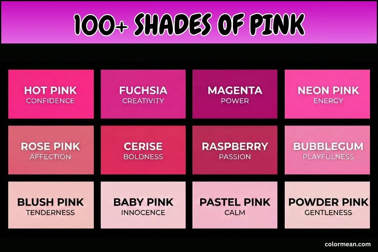
Pink is more than just a soft version of red. It carries charm, warmth, and personality, appearing in countless shades that are unique and vibrant. In this post, you will explore over 100 shades of pink, from bold hot pink to gentle rose pink, lively coral pink, and subtle salmon pink—each shade with its own character.
We provide hex, RGB, and CMYK codes for every color, along with meanings and practical uses. This makes it simple to choose the right pink for fashion, design, art, or decoration.
By the end of this guide, you will understand how each pink looks, feels, and works. You’ll be able to pick the perfect shade for any project or palette.
Let’s step into the colorful and captivating world of pink shades.
Pink
Pink is the foundational, pale red family tint, a desaturated tone that immediately conveys softness and nurturing warmth. Historically, this specific tint became culturally significant in the West post-World War II, famously associated with femininity and gentle charm. Interestingly, it was not gendered until the mid-20th century. Furthermore, Pink carries meanings of innocence, romance, and compassion. Therefore, it is widely used in cosmetic packaging, intimate apparel, and playful design to evoke a soothing, approachable feel.
- HEX #FFC0CB
- RGB 255, 192, 203
- CMYK 0, 25, 20, 0
Light Pink
Light Pink is a very pale, whitish variation that feels almost translucent. This shade developed alongside its parent as a lighter, more innocent alternative for baby clothes and accessories. Consequently, it is strongly tied to sweetness, delicacy, and childhood. Moreover, Light Pink often appears in nursery decor, confectionery branding, and spring fashion to create an airy, gentle aesthetic.
- HEX #FFB6C1
- RGB 255, 182, 193
- CMYK 0, 29, 24, 0
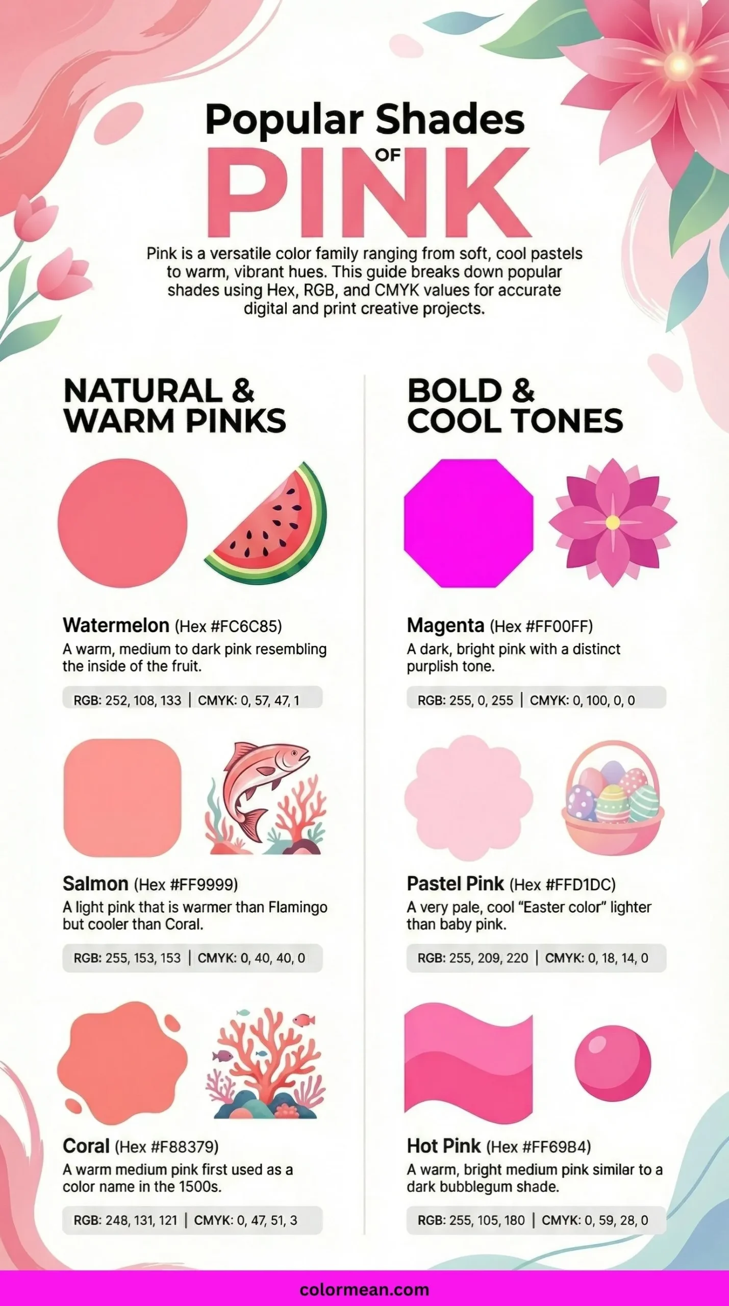
Hot Pink
Hot Pink is an intense, electrifying shade that demands immediate attention. It emerged powerfully in the punk and new wave fashion movements of the 1970s and 80s as a symbol of rebellion. This color embodies boldness, exuberance, and unapologetic energy. Thus, Hot Pink is a staple in club wear, vibrant advertising, and pop art to project confidence and high visibility.
- HEX #FF69B4
- RGB 255, 105, 180
- CMYK 0, 59, 29, 0
Deep Pink
Deep Pink is a rich, almost red, highly saturated pink with remarkable depth. This shade is one of the original X11 web colors from the 1980s, ensuring its digital legacy. It represents passion, intensity, and dramatic flair. As a result, Deep Pink is frequently chosen for evening wear, floral arrangements, and digital highlights where a strong, romantic statement is required.
- HEX #FF1493
- RGB 255, 20, 147
- CMYK 0, 92, 42, 0
Baby Pink
Baby Pink is a very soft, cool-toned, dusty pink that feels nostalgic and serene. Traditionally, this specific hue was used for infant garments and nursery items long before gender-specific color coding. It symbolizes tenderness, safety, and new beginnings. Accordingly, Baby Pink is perfect for product lines for newborns, vintage-themed designs, and soothing interior accents.
- HEX #F4C2C2
- RGB 244, 194, 194
- CMYK 0, 20, 20, 4
Blush Pink
Blush Pink mimics the natural, warm flush of cheeks, creating a healthy, living hue. This color rose to prominence in the 2010s as a key component of the “millennial pink” trend, favored for its sophistication. It evokes natural beauty, modesty, and understated elegance. Hence, Blush Pink is a favorite in cosmetics, minimalist wedding palettes, and modern interior design.
- HEX #F2B5D4
- RGB 242, 181, 212
- CMYK 0, 25, 12, 5
Rose Pink
Rose Pink is a bright, clear, medium pink directly inspired by classic garden roses. This shade has been a staple in art and textiles for centuries, often made from early organic dyes. It is inherently linked to gratitude, grace, and classic femininity. Consequently, Rose Pink is ideal for floristry branding, romantic stationery, and spring season marketing.
- HEX #FF66CC
- RGB 255, 102, 204
- CMYK 0, 60, 20, 0
Dusty Pink
Dusty Pink is a muted, grayish pink that feels vintage and subdued. It gained popularity in the 1930s and 1950s interior design for its calming, refined quality. This color suggests subtlety, nostalgia, and mature romance. Therefore, Dusty Pink is commonly used in heritage branding, rustic wedding decor, and muted fashion collections.
- HEX #D58A94
- RGB 213, 138, 148
- CMYK 0, 35, 31, 16
Pastel Pink
Pastel Pink is an extremely light, whitened pink with a high value and low saturation. This shade belongs to the broader pastel color family cherished in Rococo art and spring festivals. It communicates softness, sweetness, and a dreamy quality. Thus, Pastel Pink is ubiquitous in Easter decorations, macaron packaging, and soft UI design elements.
- HEX #FFD1DC
- RGB 255, 209, 220
- CMYK 0, 18, 14, 0
Bubblegum Pink
Bubblegum Pink is a cheerful, synthetic-looking, bright pink reminiscent of its sugary namesake. This color exploded in 1950s American pop culture alongside the commercialization of bubblegum. It embodies playful fun, youthfulness, and lighthearted energy. As a result, it’s a go-to for toy manufacturing, candy branding, and playful children’s apparel.
- HEX #FFC1CC
- RGB 255, 193, 204
- CMYK 0, 24, 20, 0
Cotton Candy Pink
Cotton Candy Pink is a whimsical, very light pink with a subtle blue undertone, mirroring the spun sugar confection. This shade became iconic through carnival and fairground aesthetics of the 20th century. It evokes nostalgia, whimsy, and airy delight. Therefore, Cotton Candy Pink is frequently used in party supplies, fantasy-themed designs, and confectionery advertising to create a sweet, ethereal mood.
- HEX #FFBCD9
- RGB 255, 188, 217
- CMYK 0, 26, 15, 0
Carnation Pink
Carnation Pink is a bright, warm, medium pink named after the popular Dianthus flower. This hue was famously used in artificial floral arrangements and became a symbol for Mother’s Day. It signifies fascination, distinction, and a mother’s enduring love. Consequently, Carnation Pink is prominent in floristry, greeting cards, and cheerful spring fashion.
- HEX #FFA6C9
- RGB 255, 166, 201
- CMYK 0, 35, 21, 0
Flamingo Pink
Flamingo Pink is a bold, tropical pink-orange inspired by the plumage of the bird. This vibrant color captures the exotic, playful spirit of mid-century tropical decor and Florida motifs. It represents flamboyance, confidence, and social fun. Thus, Flamingo Pink is perfect for summer collections, poolside branding, and statement home decor.
- HEX #FC8EAC
- RGB 252, 142, 172
- CMYK 0, 44, 32, 1
Cherry Blossom Pink
Cherry Blossom Pink is a very delicate, pale pink with a neutral balance, evoking the fleeting Sakura flowers. This shade is deeply rooted in Japanese culture and the Hanami tradition, symbolizing transience. It conveys beauty, renewal, and the gentle passage of time. Accordingly, it is used in spring festivals, wellness branding, and delicate artistic illustrations.
- HEX #FFB7C5
- RGB 255, 183, 197
- CMYK 0, 28, 23, 0
Peony Pink
Peony Pink is a lush, moderately saturated pink with slight purple notes, named after the voluminous bloom. Historically associated with wealth and prosperity in Chinese art, this color denotes romance, good fortune, and bashfulness. As a result, Peony Pink is a classic choice for luxurious wedding bouquets, elegant packaging, and botanical prints.
- HEX #E8AEB7
- RGB 232, 174, 183
- CMYK 0, 25, 21, 9
Rose Quartz Pink
Rose Quartz Pink is a soft, dusty, slightly mauve-toned pink inspired by the translucent crystal. Pantone named it Color of the Year in 2016, highlighting its connection to mindfulness and tranquility. This shade promotes unconditional love, inner peace, and soothing energy. Hence, it is popular in spiritual wellness products, serene interior palettes, and jewelry design.
- HEX #F7CAC9
- RGB 247, 202, 201
- CMYK 0, 18, 19, 3
Ballet Pink
Ballet Pink is a pale, peachy-beige pink that mimics the traditional satin of ballet slippers. This color is steeped in the history of classical dance and theatrical costuming. It symbolizes discipline, grace, and soft sophistication. Therefore, Ballet Pink is quintessential for dancewear, children’s formal wear, and elegant, neutral paint colors.
- HEX #F3C1D5
- RGB 243, 193, 213
- CMYK 0, 21, 12, 5
Tea Rose Pink
Tea Rose Pink is a grayish, desaturated antique pink reminiscent of dried rose petals. It was a fashionable hue in Victorian-era decor and fashion for its subdued, refined quality. This color suggests nostalgia, quiet charm, and bygone elegance. Consequently, it is often found in heritage branding, vintage textile restoration, and period film costumes.
- HEX #F4C2C2
- RGB 244, 194, 194
- CMYK 0, 20, 20, 4
Mauve Pink
Mauve Pink is a pale, grayish purple-pink, a muted cousin of the original 19th-century mauve dye. This shade was part of the first synthetic dye revolution, accidentally created by William Henry Perkin. It conveys subtle innovation, nostalgia, and understated romance. Thus, Mauve Pink is used in vintage wallpaper, lingerie, and muted floral arrangements.
- HEX #E0B0C4
- RGB 224, 176, 196
- CMYK 0, 21, 13, 12
Orchid Pink
Orchid Pink is a light, cool-toned pink with a definitive lavender influence, named for the exotic flower. This color draws from the Orchidaceae family’s diversity, representing rare beauty. It embodies luxury, refinement, and exotic femininity. Accordingly, Orchid Pink is selected for beauty product packaging, special occasion invitations, and contemporary fashion accents.
- HEX #F2BDCD
- RGB 242, 189, 205
- CMYK 0, 22, 15, 5
Thulian Pink
Thulian Pink is a deep, reddish pink with a historical name derived from the mythical island of Thule. This rich shade was popular in late 19th-century European fashion before fading into obscurity. It signifies mystery, historic opulence, and forgotten intensity. Therefore, Thulian Pink is rediscovered in period costume design, dramatic makeup palettes, and niche luxury goods.
- HEX #DE6FA1
- RGB 222, 111, 161
- CMYK 0, 50, 27, 13
Amaranth Pink
Amaranth Pink is a vibrant, rosy magenta named after the unfading “Amaranth” flower from Greek mythology. This color symbolizes immortality and enduring love due to its namesake’s legendary never-wilting properties. It conveys lasting beauty, vibrant health, and timeless appeal. Consequently, Amaranth Pink is used in floral art, symbolic jewelry, and vibrant graphic design.
- HEX #F19CBB
- RGB 241, 156, 187
- CMYK 0, 35, 22, 5
Fuchsia Pink
Fuchsia Pink is a bold, purplish-red that sits between magenta and hot pink, named after the Fuchsia plant. This electric color became a digital age staple as a key pigment in printing and screen display. It represents confidence, assertiveness, and electric energy. Thus, Fuchsia Pink is essential for high-impact logos, nightlife posters, and athletic wear.
- HEX #FF77FF
- RGB 255, 119, 255
- CMYK 0, 53, 0, 0
Watermelon Pink
Watermelon Pink is a juicy, medium pink with a subtle warm, red undertone, evoking the fruit’s flesh. This shade is intrinsically linked to summer, picnics, and refreshing sweetness. It embodies playful fun, refreshing vitality, and casual enjoyment. Accordingly, Watermelon Pink is perfect for summer product lines, playful swimwear, and fresh food marketing.
- HEX #FC6C85
- RGB 252, 108, 133
- CMYK 0, 57, 47, 1
Coral Pink
Coral Pink is a warm, orange-infused pink that draws its name from marine coral skeletons. This shade rose to major popularity in 1950s mid-century modern design and fashion. It suggests warmth, optimism, and lively charm. Consequently, Coral Pink is a favorite for retro revival designs, sunset-themed visuals, and welcoming interior accents.
- HEX #F88379
- RGB 248, 131, 121
- CMYK 0, 47, 51, 3
Salmon Pink
Salmon Pink is a soft, orange-pink with a slightly grayed saturation, mimicking the flesh of the fish. This color has been a classic neutral in interior design for decades due to its warmth without being overpowering. It conveys approachability, subtle warmth, and understated comfort. Thus, Salmon Pink is widely used in hospitality design, cozy knitwear, and natural cosmetic packaging.
- HEX #FF91A4
- RGB 255, 145, 164
- CMYK 0, 43, 36, 0
Light Salmon Pink
Light Salmon Pink is a pale, peachy version of Salmon with more white added. This gentle hue is a staple in coastal and cottage-style decor for its sunny, washed-out quality. It evokes gentle warmth, soft dawn light, and serene simplicity. Therefore, it is ideal for beach house interiors, spring fashion layers, and soothing branding.
- HEX #FFA07A
- RGB 255, 160, 122
- CMYK 0, 37, 52, 0
Strawberry Pink
Strawberry Pink is a bright, slightly cool-toned pink-red reminiscent of ripe strawberry fruit. This delicious shade is a key color in kawaii and cute culture aesthetics from Japan. It symbolizes sweetness, playful indulgence, and youthful energy. As a result, Strawberry Pink is central to cute stationery, dessert cafe branding, and playful accessory design.
- HEX #FC5A8D
- RGB 252, 90, 141
- CMYK 0, 64, 44, 1
Punch Pink
Punch Pink is a vivid, high-energy pink with strong red undertones, named after the festive beverage. This color captures the spirit of celebration and bold social gatherings. It represents exuberance, festivity, and a bold statement. Hence, Punch Pink is frequently chosen for party decorations, festival wear, and attention-grabbing promotional materials.
- HEX #F25278
- RGB 242, 82, 120
- CMYK 0, 66, 50, 5
Taffy Pink
Taffy Pink is a cheerful, medium-light pink that evokes the stretched, sugary candy sold at boardwalks. This color is rooted in American nostalgia and vintage candy shop aesthetics. It suggests playfulness, simple pleasures, and nostalgic joy. Accordingly, Taffy Pink is used in retro candy packaging, children’s toys, and fun, casual apparel.
- HEX #FF9ECD
- RGB 255, 158, 205
- CMYK 0, 38, 20, 0
Rouge Pink
Rouge Pink is a deep, crimson-toned pink, historically the color of traditional cheek rouge. This shade has been used for centuries in cosmetics, dating back to ancient Egypt and Greece. It embodies classic beauty, theatrical drama, and enhanced vitality. Consequently, Rouge Pink is foundational in vintage makeup compacts, luxury cosmetic branding, and classic portraiture.
- HEX #E0115F
- RGB 224, 17, 95
- CMYK 0, 92, 58, 12
Cerise Pink
Cerise Pink is a vivid, deep reddish-pink, named after the French word for cherry. This bold color was a fashion powerhouse in the 1950s, often seen in elegant dresses and lipsticks. It signifies bold glamour, vibrant energy, and luxurious taste. Thus, Cerise Pink is ideal for high-fashion accessories, dramatic interior accents, and gourmet food branding.
- HEX #EC3B83
- RGB 236, 59, 131
- CMYK 0, 75, 44, 7
Raspberry Pink
Raspberry Pink is a rich, slightly purple-toned pink that mirrors the berry’s deep, juicy interior. This decadent shade is associated with indulgence, richness, and a touch of decadence. It conveys bold flavor, luxurious depth, and sophisticated energy. Therefore, Raspberry Pink is often used in luxury confectionery packaging, plush textiles, and decadent beauty products.
- HEX #E30B5D
- RGB 227, 11, 93
- CMYK 0, 95, 59, 11
Berry Pink
Berry Pink is a darkened, red-leaning pink that captures the essence of mixed berries like cranberry and blackberry. This color evokes natural richness, autumnal warmth, and rustic charm. It suggests wholesomeness, hearty comfort, and organic abundance. Accordingly, Berry Pink is a staple in farmhouse decor, fall fashion palettes, and artisanal food labels.
- HEX #C83F49
- RGB 200, 63, 73
- CMYK 0, 68, 64, 22
Lipstick Pink
Lipstick Pink is a classic, true medium-red pink that is the archetypal shade of many iconic lip colors. This hue is synonymous with femininity, power, and self-expression across decades of beauty trends. It represents confidence, allure, and classic style. Consequently, Lipstick Pink is central to beauty industry marketing, power dressing, and vintage graphic design.
- HEX #D5174E
- RGB 213, 23, 78
- CMYK 0, 89, 63, 16
Magenta Pink
Magenta Pink is a pure, intense purplish-red, one of the primary subtractive colors (CMYK) in printing. This color was first formulated as a synthetic aniline dye in 1859 and revolutionized color printing. It symbolizes universal harmony, spiritual balance, and non-conformity. Thus, Magenta Pink is critical for printing processes, psychedelic art, and bold, modern design.
- HEX #FF00FF
- RGB 255, 0, 255
- CMYK 0, 100, 0, 0
Ultra Pink
Ultra Pink is a brilliant, slightly bluish fluorescent pink, an intensified version of magenta. This shade became iconic in 1980s pop culture, associated with neon signs and retro-futurism. It embodies synthetic vibrancy, hyper-energy, and futuristic flair. Therefore, Ultra Pink is used for neon lighting effects, arcade aesthetics, and cyberpunk-themed visuals.
- HEX #FF6FFF
- RGB 255, 111, 255
- CMYK 0, 56, 0, 0
Shocking Pink
Shocking Pink is an extremely vivid, cool-toned pink famously pioneered by designer Elsa Schiaparelli in the 1930s. This audacious color was a deliberate fashion rebellion against the muted tones of its era. It represents avant-garde daring, artistic surprise, and unbridled creativity. As a result, it remains a statement in high fashion, surrealist art, and provocative branding.
- HEX #FC0FC0
- RGB 252, 15, 192
- CMYK 0, 94, 24, 1
Neon Pink
Neon Pink is an eye-searing, maximally bright pink with a blue undertone, mimicking gas-discharge neon lights. This color defines urban nightlife, digital gaming culture, and extreme sports aesthetics. It screams attention, high voltage, and contemporary edge. Hence, Neon Pink is essential for safety gear accents, club flyers, and techwear fashion.
- HEX #FF10F0
- RGB 255, 16, 240
- CMYK 0, 94, 6, 0
Electric Pink
Electric Pink is a intense, reddish fluorescent pink that seems to glow with its own light. This shade captures the energy of rock music and alternative fashion from the late 20th century. It conveys raw power, rebellious passion, and unstoppable momentum. Accordingly, Electric Pink is powerful for music festival branding, extreme sports graphics, and dynamic street art.
- HEX #F62681
- RGB 246, 38, 129
- CMYK 0, 85, 48, 4
Barbie Pink
Barbie Pink is a distinctive, bright, cool-toned pink officially trademarked by Mattel for its iconic doll. This color became a global cultural phenomenon after the doll’s 1959 launch, shaping beauty ideals. It symbolizes fantasy, consumerism, and aspirational femininity. Consequently, Barbie Pink is used in toy marketing, themed merchandise, and pop art commentary on consumer culture.
- HEX #E0218A
- RGB 224, 33, 138
- CMYK 0, 85, 38, 12
Princess Pink
Princess Pink is a soft, sweet, light pink that embodies storybook fairy-tale royalty. This shade is perpetuated by children’s media and Disney princess marketing as a symbol of dreamy idealism. It evokes innocence, romantic fantasy, and gentle kindness. Thus, Princess Pink is ubiquitous in children’s toys, party dresses, and fantasy-themed entertainment.
- HEX #F8C8DC
- RGB 248, 200, 220
- CMYK 0, 19, 11, 3
Millennial Pink
Millennial Pink is a muted, dusty rose-beige that took over design trends in the mid-2010s. This sophisticated shade is notably gender-ambiguous, reflecting a shift towards more inclusive color palettes. It represents modernity, muted optimism, and curated calm. Therefore, it dominates contemporary interior design, tech accessory branding, and minimalist fashion.
- HEX #F3CFC6
- RGB 243, 207, 198
- CMYK 0, 15, 19, 5
Rose Gold Pink
Rose Gold Pink is a soft, metallic pink with subtle copper undertones, mimicking the popular alloy. This color saw a massive resurgence in consumer electronics and jewelry in the 2010s. It signifies luxurious warmth, modern romance, and trendy elegance. Accordingly, Rose Gold Pink is key for luxury product finishes, wedding decor, and high-end cosmetic packaging.
- HEX #E6C7C2
- RGB 230, 199, 194
- CMYK 0, 13, 16, 10
Champagne Pink
Champagne Pink is a pale, warm pink with a beige-gold sheen, evoking the bubbly beverage’s effervescence. This elegant hue is a staple in formalwear and bridal fashion for its neutral, celebratory feel. It conveys subtle celebration, refined taste, and understated luxury. Consequently, it is used for wedding invitations, sophisticated lingerie, and premium branding.
- HEX #F7E7CE
- RGB 247, 231, 206
- CMYK 0, 6, 17, 3
Antique Pink
Antique Pink is a grayish, faded rosy hue that suggests aged fabric or weathered paint. This color mimics the patina of time on textiles and porcelain from the 18th and 19th centuries. It embodies heritage, nostalgia, and enduring softness. Thus, Antique Pink is perfect for historical restoration, vintage-inspired crafts, and shabby-chic decor.
- HEX #C08081
- RGB 192, 128, 129
- CMYK 0, 33, 33, 25
Old Rose Pink
Old Rose Pink is a dusty, medium pink with brownish undertones, resembling a dried, historic rose. This melancholic shade was beloved in Victorian mourning jewelry and post-romantic art. It suggests faded beauty, memory, and gentle sorrow. Therefore, Old Rose Pink is often found in heritage collections, poetic book design, and autumn garden themes.
- HEX #C08081
- RGB 192, 128, 129
- CMYK 0, 33, 33, 25
Shell Pink
Shell Pink is a very pale, warm pink with a hint of yellow, inspired by the interior of certain seashells. This delicate color is linked to coastal serenity, natural elegance, and organic beauty. It evokes calmness, purity, and gentle warmth. As a result, Shell Pink is used in beachside decor, spa branding, and delicate porcelain finishes.
- HEX #F2D4D7
- RGB 242, 212, 215
- CMYK 0, 12, 11, 5
Cameo Pink
Cameo Pink is a soft, uniform peachy-pink reminiscent of the carved profile portraits on cameo jewelry. This color hails from Neoclassical and Victorian jewelry trends, symbolizing idealized beauty. It represents delicacy, classicism, and refined artistry. Hence, Cameo Pink is ideal for bridal jewelry design, vintage pattern illustrations, and elegant stationery.
- HEX #EFBBCC
- RGB 239, 187, 204
- CMYK 0, 22, 15, 6
Fairy Tale Pink
Fairy Tale Pink is a light, whimsical pink with a touch of lavender, evoking magical storybook illustrations. This shade is central to fantasy genre aesthetics and children’s book art. It symbolizes enchantment, wonder, and dreamy escapism. Accordingly, Fairy Tale Pink is chosen for theme park design, costume design for fantasy characters, and whimsical product packaging.
- HEX #F6C1CC
- RGB 246, 193, 204
- CMYK 0, 22, 17, 4
Primrose Pink
Primrose Pink is a pale, yellowish pink named after the early spring flower, Primula vulgaris. This shade is historically associated with English cottage gardens and the first signs of spring. It symbolizes young love, optimism, and gentle new beginnings. Consequently, Primrose Pink is often used in garden-themed branding, cheerful spring fashion, and welcoming home decor.
- HEX #EDC9AF
- RGB 237, 201, 175
- CMYK 0, 15, 26, 7
Soft Pink
Soft Pink is a general term for any pale, low-saturation pink, but specifically refers to a nearly white, gentle hue. This versatile color acts as a modern neutral in design, providing warmth without overwhelming a space. It promotes tranquility, kindness, and subtle warmth. Thus, Soft Pink is ubiquitous in nursery walls, healthcare environments, and minimalist UI backgrounds.
- HEX #FADADD
- RGB 250, 218, 221
- CMYK 0, 13, 12, 2
Muted Pink
Muted Pink is a generic descriptor for a pink with significant gray added, lowering its intensity and brightness. This sophisticated shade is a cornerstone of Scandinavian and minimalist design palettes. It suggests restrained elegance, quiet comfort, and modern maturity. Therefore, Muted Pink is favored for contemporary architecture, cozy knitwear, and understated branding.
- HEX #D8A7B1
- RGB 216, 167, 177
- CMYK 0, 23, 18, 15
Smoky Pink
Smoky Pink is a deep, grayish pink with a moody, dusky quality, as if seen through haze or smoke. This dramatic color emerged from noir aesthetics and moody, romantic interior design. It evokes mystery, intimacy, and sophisticated depth. Accordingly, Smoky Pink is powerful in evening wear, atmospheric restaurant interiors, and dramatic photographic backdrops.
- HEX #C68E96
- RGB 198, 142, 150
- CMYK 0, 28, 24, 22
Powder Pink
Powder Pink is a very light, cool-toned pink reminiscent of loose face powder or powdered sugar. This color is tied to retro glamour and the ritual of dressing tables from the early 20th century. It conveys flawless finish, delicate preparation, and vintage vanity. Hence, Powder Pink is classic for cosmetic compacts, bakery packaging, and feminine lingerie.
- HEX #FFB2D0
- RGB 255, 178, 208
- CMYK 0, 30, 18, 0
Rosewood Pink
Rosewood Pink is a dark, brownish pink inspired by the heartwood of the Dalbergia genus of trees. This rich, earthy shade connects to craftsmanship, luxury furniture, and musical instruments. It signifies warmth, organic luxury, and grounded elegance. Consequently, Rosewood Pink is used in high-end product finishes, autumnal fashion, and nature-inspired graphic design.
- HEX #9E5E6F
- RGB 158, 94, 111
- CMYK 0, 41, 30, 38
Desert Pink
Desert Pink is a warm, sandy beige-pink that captures the color of sun-bleached rocks and sand at dusk. This color is directly drawn from the landscapes of the American Southwest and Australian outbacks. It embodies warmth, resilience, and serene vastness. Thus, Desert Pink is ideal for earth-toned fashion, spa retreat branding, and desert modernism architecture.
- HEX #E8C2C8
- RGB 232, 194, 200
- CMYK 0, 16, 14, 9
Cranberry Pink
Cranberry Pink is a vibrant, red-dominated pink with a hint of purple, like the tart berry. This bold shade is associated with holiday festivity, winter warmth, and tart sweetness. It suggests celebration, bold flavor, and invigorating energy. Therefore, Cranberry Pink is prominent in holiday decor, festive tableware, and winter cosmetic collections.
- HEX #DC143C
- RGB 220, 20, 60
- CMYK 0, 91, 73, 14
Mulberry Pink
Mulberry Pink is a deep, reddish-purple pink named after the fruit of the Morus tree. This regal shade has historical connections to Tyrian purple and Byzantine silks, implying status. It represents opulence, wisdom, and creative abundance. Accordingly, Mulberry Pink is selected for luxurious fabrics, academic regalia accents, and rich, dramatic wall colors.
- HEX #C54B8C
- RGB 197, 75, 140
- CMYK 0, 62, 29, 23
Wine Pink
Wine Pink is a dark, muted pink with strong brown and purple notes, evoking a fine red wine. This sophisticated color is inherently linked to vintage, luxury, and adult refinement. It conveys maturity, richness, and complex depth. Consequently, Wine Pink is a staple in fine dining aesthetics, luxury leather goods, and mature, elegant fashion lines.
- HEX #B11226
- RGB 177, 18, 38
- CMYK 0, 90, 79, 31
Blush Rose Pink
Blush Rose Pink is a soft, warm pink that combines the healthy glow of a blush with the classic form of a rose. This shade sits at the heart of the modern “living coral” and blush tone trends in contemporary design. It evokes natural radiance, youthful vitality, and approachable elegance. Therefore, Blush Rose Pink is ubiquitous in beauty product launches, wellness app interfaces, and fresh, inviting retail spaces.
- HEX #F6B6C1
- RGB 246, 182, 193
- CMYK 0, 26, 22, 4
Petal Pink
Petal Pink is an extremely pale, almost white pink with the faintest warm undertone, like a flower petal held to the light. This ethereal color suggests fragility, purity, and pristine newness. It is often used to create a sense of airiness and delicate beauty. Consequently, Petal Pink is perfect for bridal gown linings, high-end skincare packaging, and soft-focus photographic effects.
- HEX #FDDDE6
- RGB 253, 221, 230
- CMYK 0, 13, 9, 1
Piggy Pink
Piggy Pink is a light, cheerful pink specifically named for its association with the classic children’s toy, the piggy bank. This playful hue is rooted in nursery decor and toy design from the mid-20th century. It symbolizes childish joy, innocence, and playful savings. Thus, Piggy Pink is commonly found in children’s banking products, playful plush toys, and whimsical kitchenware.
- HEX #FDD7E4
- RGB 253, 215, 228
- CMYK 0, 15, 10, 1
Seashell Pink
Seashell Pink is a whitish pink with a cool, sometimes slightly iridescent quality, named for the inside of a conch shell. This color evokes oceanic calm, natural treasures, and serene beaches. It promotes peacefulness, collected simplicity, and organic inspiration. Accordingly, Seashell Pink is a favorite for coastal interior design, spa environments, and minimalist jewelry.
- HEX #FFF0F5
- RGB 255, 240, 245
- CMYK 0, 6, 4, 0
Rosewater Pink
Rosewater Pink is a pale, clear pink with a neutral balance, reminiscent of the fragrant floral water used in cosmetics and cuisine. This shade has centuries-old roots in Persian and Indian culinary and beauty traditions. It signifies gentle refreshment, subtle fragrance, and holistic care. Hence, Rosewater Pink is key for natural cosmetic brands, gourmet dessert styling, and serene yoga studio branding.
- HEX #F5C2C7
- RGB 245, 194, 199
- CMYK 0, 21, 19, 4
Pink Lemonade
Pink Lemonade is a bright, slightly orange-toned pink that captures the sweet, summery beverage. This color is intrinsically linked to American summertime, county fairs, and carefree leisure. It embodies sweet fun, nostalgic summers, and playful refreshment. Consequently, Pink Lemonade is ideal for summer festival merch, beverage branding, and vibrant casual wear.
- HEX #FFB3C6
- RGB 255, 179, 198
- CMYK 0, 30, 22, 0
Pink Pearl
Pink Pearl is a soft, luminous pink with a subtle gray-lavender undertone, inspired by the iridescent gemstone. This elegant shade was popular in Art Nouveau jewelry and vintage cosmetics for its subtle glow. It suggests understated luxury, gentle wisdom, and inner glow. Therefore, Pink Pearl is used in luxury stationery, wedding china patterns, and sophisticated fragrance packaging.
- HEX #E7ACCF
- RGB 231, 172, 207
- CMYK 0, 26, 10, 9
Pink Frosting
Pink Frosting is a sweet, creamy pastel pink that looks perfectly edible, like buttercream icing. This delectable color is central to bakery aesthetics and birthday party culture. It conveys celebration, sugary delight, and playful indulgence. Thus, Pink Frosting is a natural choice for bakery logos, party supplies, and playful children’s decor.
- HEX #FFD1E8
- RGB 255, 209, 232
- CMYK 0, 18, 9, 0
Pink Flamingo
Pink Flamingo is a bold, warm pink that directly references the plastic lawn ornament phenomenon of the 1950s. This kitsch shade celebrates pop art, retro Americana, and playful suburban style. It represents funky nostalgia, bold lawn statements, and unapologetic cheer. Accordingly, Pink Flamingo is iconic for retro-themed design, pool party gear, and statement home accessories.
- HEX #FC74FD
- RGB 252, 116, 253
- CMYK 0, 54, 0, 1
Pink Sorbet
Pink Sorbet is a cool, bright, slightly purplish pink that evokes the frozen, fruity dessert. This refreshing color suggests light indulgence, fruity refreshment, and a clean finish. It is associated with summer treats, fitness vibrancy, and modern, clean design. Consequently, Pink Sorbet is effective for healthy snack packaging, activewear, and contemporary website accents.
- HEX #F6AEC7
- RGB 246, 174, 199
- CMYK 0, 29, 19, 4
Pink Peony
Pink Peony is a light, cool-toned pink taken from the lush, layered petals of the peony bloom. This shade is a darling of wedding floristry and romantic garden design. It embodies prosperity, happy marriage, and bashful romance. Therefore, Pink Peony is extensively used in bridal bouquets, luxury wedding invitations, and feminine fragrance packaging.
- HEX #F8BBD0
- RGB 248, 187, 208
- CMYK 0, 25, 16, 3
Pink Orchid
Pink Orchid is a vibrant, purplish-pink directly named for the exotic and diverse orchid flower. This color carries connotations of luxury, rare beauty, and refined taste due to the flower’s prized status. It symbolizes mature charm, sophistication, and exotic allure. Consequently, Pink Orchid is chosen for high-end beauty products, elegant home decor, and tropical-themed design.
- HEX #DA70D6
- RGB 218, 112, 214
- CMYK 0, 49, 2, 15
Pink Tulip
Pink Tulip is a clear, cheerful medium pink inspired by the spring bulb flower. This shade is synonymous with perfect love, cheerful spring, and declaration of care. It evokes hopefulness, vibrant renewal, and simple joy. Thus, Pink Tulip is a staple in spring garden marketing, festive greeting cards, and fresh, clean branding.
- HEX #FF8DAA
- RGB 255, 141, 170
- CMYK 0, 45, 33, 0
Pink Dahlia
Pink Dahlia is a deep, vivid pink with slight berry undertones, named for the dramatic, geometric flower. This bold color reflects the dahlia’s association with elegance, diversity, and inner strength. It represents standing out, embracing change, and dramatic beauty. Accordingly, Pink Dahlia is powerful for artistic branding, bold fashion statements, and vibrant garden center signage.
- HEX #E75480
- RGB 231, 84, 128
- CMYK 0, 64, 45, 9
Pink Hibiscus
Pink Hibiscus is a warm, tropical pink with orange-red influences, mirroring the large, showy tropical blossom. This color instantly evokes vacation, warm climates, and welcoming hospitality. It signifies delicate beauty, fleeting pleasure, and tropical passion. Hence, Pink Hibiscus is perfect for resort wear, summer cocktail branding, and exotic destination marketing.
- HEX #FF6F91
- RGB 255, 111, 145
- CMYK 0, 56, 43, 0
Pink Azalea
Pink Azalea is a bright, pure pink with cool undertones, inspired by the spectacular spring-blooming shrub. This color is linked to temperance, femininity, and abundance in Chinese culture. It conveys fragile passion, taking care, and vibrant spring energy. Therefore, Pink Azalea is used in botanical prints, spring festival decorations, and feminine activewear.
- HEX #EC87C0
- RGB 236, 135, 192
- CMYK 0, 43, 19, 7
Pink Camellia
Pink Camellia is a soft, refined pink with a hint of peach, named for the elegant, waxy flower. This shade symbolizes admiration, perfection, and refined love in the language of flowers. It suggests graceful longing, understated beauty, and lasting affection. Consequently, Pink Camellia is ideal for luxury tea packaging, classic stationery, and timeless fashion details.
- HEX #F2A2C0
- RGB 242, 162, 192
- CMYK 0, 33, 21, 5
Pink Cosmos
Pink Cosmos is a light, airy pink named after the delicate, daisy-like flower that dances on slender stems. This color captures joy in love, peacefulness, and modest beauty. It evokes whimsy, lightness, and harmonious simplicity. Thus, Pink Cosmos is often used in bohemian wedding decor, ethereal fashion, and natural skincare branding.
- HEX #FFAAC9
- RGB 255, 170, 201
- CMYK 0, 33, 21, 0
Pink Magnolia
Pink Magnolia is a very pale, warm pink-beige, inspired by the iconic blossoms of the Magnolia tree. This sophisticated shade is associated with dignity, nobility, and perseverance due to the tree’s ancient lineage. It represents southern grace, timeless beauty, and sweet fragrance. Accordingly, Pink Magnolia is a classic for heritage branding, elegant interior paint, and upscale hospitality design.
- HEX #FADADD
- RGB 250, 218, 221
- CMYK 0, 13, 12, 2
Pink Rosebud
Pink Rosebud is a soft, warm pink that specifically references the unopened bud of a rose. This color symbolizes youthful beauty, purity, and a promise of love yet to unfold. It conveys potential, innocent affection, and delicate newness. Therefore, Pink Rosebud is charming for first gift flowers, young women’s fashion, and romantic poetry illustration.
- HEX #FEA3AA
- RGB 254, 163, 170
- CMYK 0, 36, 33, 0
Pink Macaron
Pink Macaron is a pale, sweet pink specifically referencing the iconic French almond meringue confection. This color is inextricably linked to Parisian chic, artisanal pastry, and modern luxury. It embodies delicate sweetness, curated aesthetics, and fashionable indulgence. Consequently, Pink Macaron is prevalent in high-end bakery branding, fashion blog graphics, and sophisticated lifestyle product design.
- HEX #F7B7C6
- RGB 247, 183, 198
- CMYK 0, 26, 20, 3
Pink Cupcake
Pink Cupcake is a bright, playful pink that evokes the frosting and sprinkles of a classic cupcake. This color is central to birthday party culture, bake sales, and playful, celebratory aesthetics. It signifies joyful celebration, childlike delight, and sugary fun. Thus, Pink Cupcake is a natural choice for children’s party supplies, playful apparel, and whimsical café interiors.
- HEX #FFB7D5
- RGB 255, 183, 213
- CMYK 0, 28, 16, 0
Pink Tutu
Pink Tutu is a light, cool-toned ballet pink, directly named for the classic layered ballet skirt. This shade captures the fantasy, discipline, and theatrical beauty of classical dance. It represents childhood dreams, artistic dedication, and ethereal performance. Accordingly, Pink Tutu is iconic for dancewear, children’s dress-up costumes, and fairy-tale themed illustrations.
- HEX #F6C1D1
- RGB 246, 193, 209
- CMYK 0, 22, 15, 4
Pink Chiffon
Pink Chiffon is an extremely pale, sheer pink with a neutral tone, mimicking the translucent fabric. This ethereal color suggests lightness, delicate luxury, and airy elegance. It is often used to create a sense of floating softness and refined grace. Therefore, Pink Chiffon is perfect for bridal veils, luxury lingerie, and soft, dreamy photographic filters.
- HEX #FFE4EC
- RGB 255, 228, 236
- CMYK 0, 11, 7, 0
Pink Satin
Pink Satin is a medium, cool pink with a subtle sheen, named for the smooth, lustrous fabric. This color evokes evening glamour, tactile luxury, and sensual softness. It conveys polished sophistication, intimate settings, and rich texture. Consequently, Pink Satin is a staple in evening gown design, luxury bedding, and high-gloss cosmetic packaging.
- HEX #E6A4B4
- RGB 230, 164, 180
- CMYK 0, 29, 22, 10
Pink Velvet
Pink Velvet is a deep, rich pink with brown undertones, inspired by the plush, dense fabric. This opulent shade is associated with royalty, Baroque interiors, and cozy decadence. It signifies dramatic comfort, sumptuous warmth, and bold luxury. Hence, Pink Velvet is powerful for statement furniture upholstery, winter accessory lines, and rich, dramatic branding.
- HEX #C71585
- RGB 199, 21, 133
- CMYK 0, 89, 33, 22
Pink Raspberry
Pink Raspberry is a deep, pinkish-red that focuses on the berry’s bright, tangy character rather than its deep purple tones. This vibrant shade suggests zesty flavor, energetic sweetness, and bold vibrancy. It is often used to communicate invigoration and fruity punch. Therefore, Pink Raspberry is effective for energy drink branding, lively sportswear, and dynamic digital illustrations.
- HEX #D64E6C
- RGB 214, 78, 108
- CMYK 0, 64, 50, 16
Pink Fig
Pink Fig is a muted, dusky pink with strong purple and brown notes, reminiscent of the fruit’s interior. This sophisticated, earthy color conveys unexpected sweetness, rustic luxury, and organic richness. It suggests mature taste, natural abundance, and understated complexity. Accordingly, Pink Fig is favored for artisanal food packaging, organic cosmetic lines, and autumnal home decor.
- HEX #C74375
- RGB 199, 67, 117
- CMYK 0, 66, 41, 22
Pink Guava
Pink Guava is a vibrant, warm salmon-pink that captures the tropical fruit’s sweet, fragrant flesh. This juicy color instantly evokes tropical vitality, exotic flavor, and healthy refreshment. It embodies sunny energy, nutritious sweetness, and vibrant appeal. Consequently, Pink Guava is ideal for tropical beverage branding, fitness apparel, and fresh, modern restaurant graphics.
- HEX #FF5C8A
- RGB 255, 92, 138
- CMYK 0, 64, 46, 0
Pink Lychee
Pink Lychee is a pale, peachy-pink with a translucent quality, inspired by the exotic fruit’s juicy interior. This delicate shade suggests rare delicacy, subtle sweetness, and exotic refreshment. It conveys luxurious treat, unique flavor, and subtle appeal. Thus, Pink Lychee is used for premium product marketing, spa menu design, and soft, luxurious textile patterns.
- HEX #FFD6DC
- RGB 255, 214, 220
- CMYK 0, 16, 14, 0
Pink Dragonfruit
Pink Dragonfruit is a shocking, neon-magenta pink inspired by the vibrant flesh of the pitaya fruit. This eye-popping color is synonymous with exotic superfoods, Instagram-worthy aesthetics, and vibrant health. It represents dramatic natural beauty, antioxidant-rich vitality, and social media buzz. Therefore, Pink Dragonfruit is powerful for smoothie bar branding, athletic wear, and cutting-edge digital art.
- HEX #FF4F9A
- RGB 255, 79, 154
- CMYK 0, 69, 40, 0
Pink Lotus
Pink Lotus is a soft, serene pink with purple undertones, named for the sacred aquatic flower in Eastern religions. This spiritual color symbolizes purity, enlightenment, and rising above adversity. It evokes tranquility, divine beauty, and spiritual awakening. Consequently, Pink Lotus is used in wellness center branding, meditation app interfaces, and serene, spiritual-themed design.
- HEX #E38FAC
- RGB 227, 143, 172
- CMYK 0, 37, 24, 11
Pink Petunia
Pink Petunia is a bright, cheerful pink with a slight coolness, mirroring the popular garden annual. This resilient bloom’s color represents soothing thoughts, lasting hope, and thriving in challenging environments. It conveys persistent cheer, garden abundance, and friendly charm. Thus, Pink Petunia is a favorite for community garden projects, cheerful home decor, and welcoming retail signage.
- HEX #E4717A
- RGB 228, 113, 122
- CMYK 0, 50, 46, 11
Pink Sorrel
Pink Sorrel is a muted, greyish pink with a hint of mauve, taken from the delicate stems and flowers of the Oxalis plant. This subtle, natural color suggests quiet joy, resilience, and understated natural beauty. It embodies gentle observation, woodland calm, and botanical intricacy. Accordingly, Pink Sorrel is chosen for herbarium aesthetics, nature journal design, and sophisticated, earthy fashion.
- HEX #D1768F
- RGB 209, 118, 143
- CMYK 0, 44, 32, 18
Pink Sunset
Pink Sunset is a warm, gradient pink that captures the soft, glowing tones of the sky at dusk. This evocative color is universally associated with peaceful endings, daily reflection, and natural spectacle. It inspires romance, calm transition, and breathtaking beauty. Therefore, Pink Sunset is iconic for travel destination marketing, romantic restaurant ambiance, and inspirational poster design.
- HEX #F4A6B8
- RGB 244, 166, 184
- CMYK 0, 32, 25, 4
Pink Horizon
Pink Horizon is a light, dusty pink with a warm glow, suggesting the first or last pink light on the horizon line. This color evokes optimism, new beginnings, and vast potential. It represents expansive hope, gentle anticipation, and serene distance. Consequently, Pink Horizon is effective for aviation or travel branding, wellness retreat marketing, and serene landscape photography titles.
- HEX #F2B3C4
- RGB 242, 179, 196
- CMYK 0, 26, 19, 5
Pink Blush Rose
Pink Blush Rose is a medium, warm pink that specifically references the ‘Blush’ variety of rose, known for its soft, creamy pink petals. This hybrid color combines the freshness of a blush with the classic form of a rose. It signifies admiration, perfect happiness, and gentle elegance. Hence, Pink Blush Rose is a premier choice for wedding floral design, premium cosmetic names, and classic feminine branding.
- HEX #F5A3B7
- RGB 245, 163, 183
- CMYK 0, 33, 25, 4
Pink Silk
Pink Silk is a soft, slightly peachy pink with an inherent luminous sheen, mimicking the fabric’s smooth texture. This luxurious color is tied to historical trade routes, haute couture, and sensuous comfort. It conveys sleek luxury, soft power, and tactile pleasure. Thus, Pink Silk is prevalent in high-fashion marketing, luxury bedding advertising, and sensual fragrance campaigns.
- HEX #E9B7CE
- RGB 233, 183, 206
- CMYK 0, 21, 12, 9
Pink Cream
Pink Cream is a pale, warm, whitened pink that resembles cream lightly tinted with berry juice. This gentle, edible hue suggests wholesome indulgence, soft sweetness, and comforting richness. It embodies gentle treat, nostalgic dessert, and cozy pampering. Accordingly, Pink Cream is used for vintage diner aesthetics, skin cream packaging, and nursery furnishings.
- HEX #FAD6E8
- RGB 250, 214, 232
- CMYK 0, 14, 7, 2
Pink Frost
Pink Frost is a very pale, cool pink with a slightly icy, blue undertone, as if pink has been touched by frost. This ethereal color suggests winter mornings, delicate chill, and quiet beauty. It conveys crisp freshness, subtle sparkle, and serene cold. Therefore, Pink Frost is ideal for winter holiday packaging, frosty makeup collections, and cool, modern web design accents.
- HEX #FFDDF4
- RGB 255, 221, 244
- CMYK 0, 13, 4, 0
Pink Whisper
Pink Whisper is an extremely pale, nearly white pink that feels soft and hushed. This color embodies subtlety, quiet communication, and understated presence. It is used to create a sense of calm and gentle suggestion without demand. Consequently, Pink Whisper is perfect for minimalist branding, serene hospital rooms, and background elements in delicate UI/UX design.
- HEX #FBE4EA
- RGB 251, 228, 234
- CMYK 0, 9, 7, 2
Pink Aura
Pink Aura is a medium, clear pink with a vibrant, glowing quality, inspired by the concept of spiritual energy fields. This metaphysical color is associated with unconditional love, compassion, and healing vibrations. It represents emotional balance, heart-centered energy, and psychic warmth. Thus, Pink Aura is chosen for holistic healing practices, spiritual workshop materials, and empathetic community branding.
- HEX #F2A9C4
- RGB 242, 169, 196
- CMYK 0, 30, 19, 5
Pink Glow
Pink Glow is a bright, neon-infused pink that appears to emit its own light, like a neon sign or digital screen. This radiant color captures the energy of nightlife, futuristic tech, and vibrant optimism. It signifies high visibility, positive energy, and magnetic attraction. Accordingly, Pink Glow is essential for event promotions, gaming peripherals, and cutting-edge tech product highlights.
- HEX #FF9EBB
- RGB 255, 158, 187
- CMYK 0, 38, 27, 0
Pink Haze
Pink Haze is a muted, grayish-lavender pink that feels soft-focused and dreamlike, as seen through mist or fog. This atmospheric color suggests nostalgic memory, soft romance, and blurred reality. It evokes dreamy ambiguity, gentle mystery, and retro soft-focus photography. Therefore, Pink Haze is used in dream pop album art, vintage filter effects, and moody, artistic interior design.
- HEX #E5A9B2
- RGB 229, 169, 178
- CMYK 0, 26, 22, 10
Pink Bloom
Pink Bloom is a fresh, healthy pink that mimics the vibrant color of a flower in full, perfect bloom. This shade represents peak vitality, flourishing health, and the joy of blossoming. It conveys youthful energy, natural perfection, and vibrant life. Consequently, Pink Bloom is ideal for health and wellness brands, spring campaign imagery, and fresh produce marketing.
- HEX #FFB8C6
- RGB 255, 184, 198
- CMYK 0, 28, 22, 0
Pink Mirage
Pink Mirage is a pale, warm pink with a dusty, elusive quality, like a beautiful vision in the desert. This color symbolizes elusive beauty, illusionary hope, and fleeting dreams. It suggests alluring distance, deceptive beauty, and romantic illusion. Thus, Pink Mirage is effective for perfume advertising, artistic project titles, and themes of desire and memory.
- HEX #F4B2C2
- RGB 244, 178, 194
- CMYK 0, 27, 20, 4
Pink Harmony
Pink Harmony is a balanced, medium pink with neutral undertones, designed to be pleasing and restful to the eye. This color promotes visual balance, peaceful coexistence, and aesthetic unity. It embodies calm coherence, design integration, and gentle balance. Accordingly, Pink Harmony is a tool in interior design schemes, brand identity systems, and collaborative workspace decor.
- HEX #EFC1CC
- RGB 239, 193, 204
- CMYK 0, 19, 15, 6
Pink Dawn
Pink Dawn is a soft, warm pink with a golden undertone, capturing the first light of morning. This hopeful color symbolizes new beginnings, gentle awakening, and daily renewal. It evokes optimistic starts, peaceful mornings, and quiet promise. Therefore, Pink Dawn is used for breakfast and café branding, mindfulness app icons, and inspirational greeting cards.
- HEX #F6B1C3
- RGB 246, 177, 195
- CMYK 0, 28, 21, 4
Pink Muse
Pink Muse is a creative, slightly purplish pink that inspires artistic thought and romantic creativity. This shade is dedicated to the goddesses of art and literature, representing inspirational beauty. It signifies artistic inspiration, romantic ideation, and creative passion. Consequently, Pink Muse is chosen for art supply branding, writer’s retreat logos, and boutique stationery shops.
- HEX #E8A0B8
- RGB 232, 160, 184
- CMYK 0, 31, 21, 9
Pink Serenity
Pink Serenity is a cool, light lavender-pink that instantly calms the mind and soothes the senses. This tranquil color is the culmination of pink’s peaceful, nurturing qualities. It embodies deep calm, emotional peace, and tranquil stillness. Thus, Pink Serenity is the final shade, perfect for spa and wellness branding, meditation spaces, and any design seeking to evoke ultimate peaceful relaxation.
- HEX #F7C5D9
- RGB 247, 197, 217
- CMYK 0, 20, 12, 3