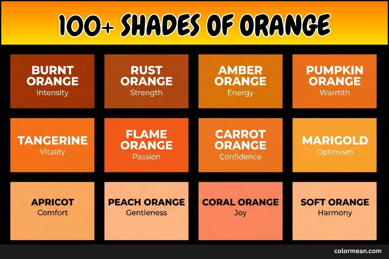
Orange is more than just a color. It radiates warmth, energy, and creativity. In this post, you will explore over 100 shades of orange. From bright tangerine to deep pumpkin, each shade carries its own character.
We include hex, RGB, and CMYK codes for every color. You will also learn the meaning and common uses of each shade. This makes it simple to choose the right orange for design, art, or decoration.
By the end of this guide, you will understand how each orange looks, feels, and works. You can quickly find the perfect shade for your project.
Let’s jump into the vibrant world of orange shades.
Amber
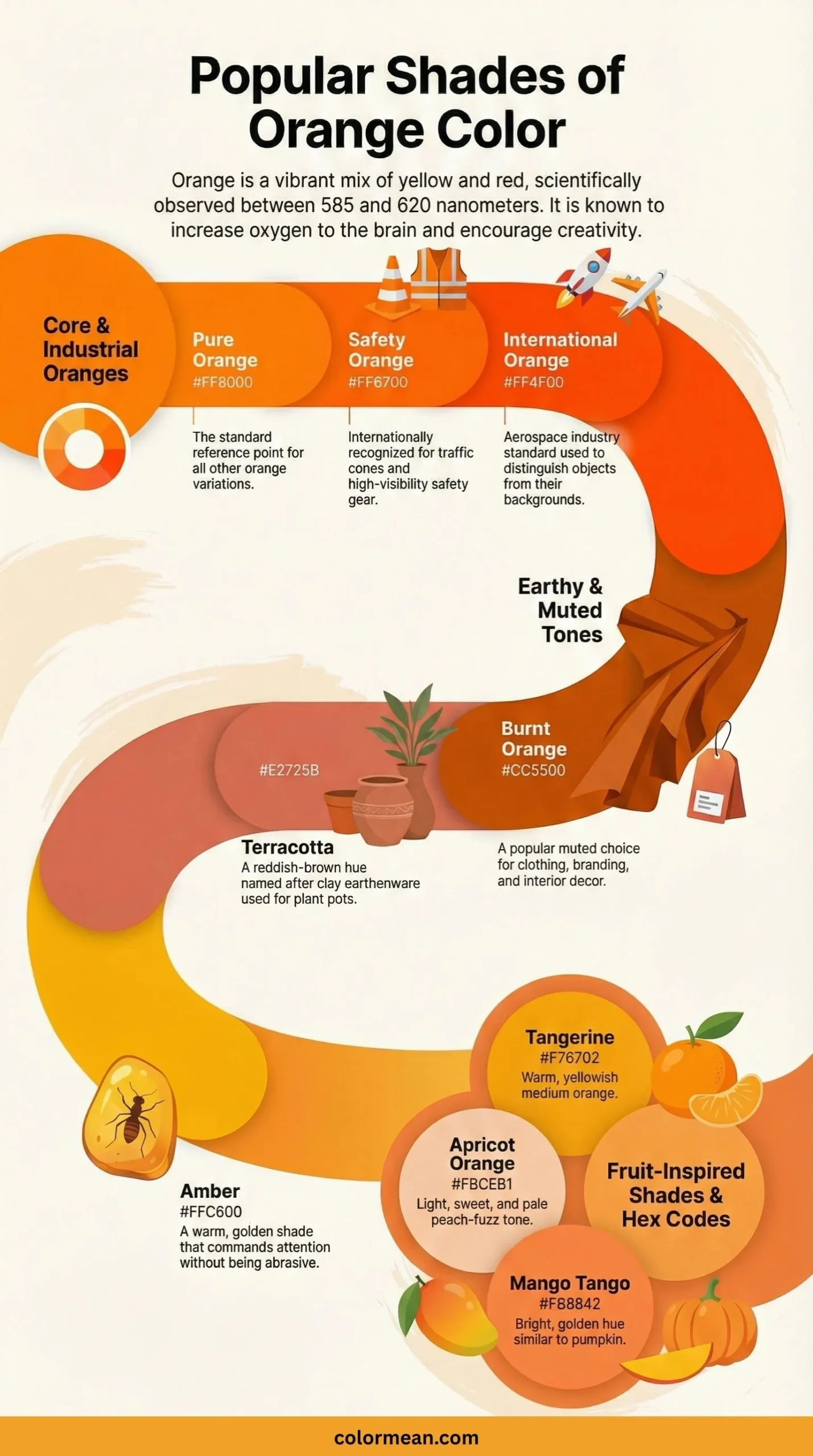
Amber is a vivid, warm shade of yellow-orange that takes its name from the fossilized tree resin known for its captivating translucence and ancient inclusions. Historically, this organic gemstone was a prized commodity along the European trade routes and was often crafted into jewelry and amulets believed to hold protective or healing properties. The color itself embodies warmth, energy, and a timeless glow, reminiscent of both sunlight and the preserved essence of prehistoric forests. Consequently, it is effectively utilized in traffic warning signals, high-visibility safety gear, and autumnal decor, where its inherent luminosity commands attention and evokes a sense of enduring energy.
- HEX #FFBF00
- RGB 255, 191, 0
- CMYK 0, 25, 100, 0
Tangerine
Tangerine is a bold, highly saturated reddish-orange, directly and vividly named after the popular citrus fruit. This color designation emerged in the English language in the late 19th century, perfectly capturing the fruit’s zesty, vibrant, and tangy peel. It is a shade that radiates enthusiasm, creativity, and fun, often associated with youthful energy and tropical vibrancy. As a result, Tangerine is a dominant and popular choice for athletic wear, energetic beverage branding, and lively summer fashion collections, where its bright and inviting nature stimulates excitement and stands out powerfully.
- HEX #F08000
- RGB 240, 128, 0
- CMYK 0, 47, 100, 6
Coral
Coral is a sophisticated and lively blend of pink, orange, and a touch of red, directly inspired by the natural hues of marine coral skeletons. This color gained significant popularity in interior design and fashion during the 18th century, symbolizing delicate beauty and oceanic elegance. It carries connotations of warmth, vivacity, and a gentle femininity, often evoking imagery of tropical reefs and sunsets. Therefore, Coral is extensively used in cosmetics, resort wear, and home decor accents, providing a refreshing and subtly energizing alternative to standard orange or pink tones.
- HEX #FF7F50
- RGB 255, 127, 80
- CMYK 0, 50, 69, 0
Pumpkin Orange
Pumpkin Orange is a rich, deeply saturated orange that serves as the quintessential hue of its namesake autumn gourd. This color is intrinsically linked to harvest festivals, particularly Halloween and Thanksgiving, symbolizing abundance, festivity, and the changing seasons. It embodies a sense of wholesome warmth, rustic comfort, and approachable vibrancy. As such, Pumpkin Orange is a staple in holiday-themed marketing, autumn home decor, and culinary branding, where it immediately conjures feelings of tradition, coziness, and seasonal joy.
- HEX #FF7518
- RGB 255, 117, 24
- CMYK 0, 54, 91, 0
Mahogany
Mahogany is a deep, reddish-brown color that takes its name from the highly prized tropical hardwood renowned for its durability, fine grain, and rich coloration. Historically associated with luxury, the wood has been used for centuries in high-quality furniture, shipbuilding, and musical instruments, representing craftsmanship, stability, and enduring value. This color evokes a sense of sophisticated tradition, grounded strength, and timeless elegance. Consequently, Mahogany is frequently employed in luxury branding, traditional interior design schemes, and leather goods, where it communicates richness and reliable quality.
- HEX #C04000
- RGB 192, 64, 0
- CMYK 0, 67, 100, 25
Apricot
Apricot is a soft, pale orange with strong pinkish undertones, named after the flesh of the delicate stone fruit. This pastel shade rose to prominence in fashion and design for its subtle, flattering, and calming qualities, often associated with romanticism and softness. It carries meanings of modesty, gentleness, and springtime renewal, offering a more muted and sophisticated alternative to brighter oranges. Thus, Apricot is commonly found in bridesmaid dresses, spring cosmetic palettes, and nursery decor, where it provides a warm yet serene and uplifting atmosphere.
- HEX #FBCEB1
- RGB 251, 206, 177
- CMYK 0, 18, 29, 2
Burnt Orange
Burnt Orange is a dark, earthy shade of orange with strong brown undertones, evoking the appearance of orange pigment that has been literally charred or oxidized. Popularized in the 1960s and 70s, this color became emblematic of autumnal warmth, rustic earthiness, and a relaxed, bohemian spirit. It suggests comfort, resilience, and a connection to nature, feeling both vibrant and subdued. Accordingly, Burnt Orange is a hallmark of university sports teams, fall fashion, and cozy interior design, where it delivers a punch of color without being overly bright or neon.
- HEX #CC5500
- RGB 204, 85, 0
- CMYK 0, 58, 100, 20
Neon Orange
Neon Orange is an intensely bright, fluorescent orange that appears to emit its own glowing light, mimicking the effect of neon gas illumination. Developed through modern synthetic pigments, this color is the epitome of high-energy, extreme visibility, and futuristic boldness. It screams attention, urgency, and dynamic action, making it impossible to ignore. Therefore, Neon Orange is strategically used for high-visibility safety equipment, extreme sports apparel, and nightclub or festival graphics, where its radiant properties ensure maximum impact both day and night.
- HEX #FF5F1F
- RGB 255, 95, 31
- CMYK 0, 63, 88, 0
Butterscotch
Butterscotch is a warm, medium orange-brown hue inspired by the creamy, sugary confection made from butter and brown sugar. This color evokes immediate sensory associations with sweetness, indulgence, and nostalgic comfort food. It embodies a sense of creamy richness, homely warmth, and approachable luxury. As a result, Butterscotch is effectively utilized in bakery branding, cozy knitwear, and warm-toned interior design elements, where it creates an inviting, comforting, and subtly decadent ambiance.
- HEX #E3963E
- RGB 227, 150, 62
- CMYK 0, 34, 73, 11
Cinnamon
Cinnamon is a warm, spicy reddish-brown color, named after the aromatic bark of the cinnamon tree used as a treasured spice for millennia. Historically, this spice was so valuable it was considered a gift fit for monarchs and deities, symbolizing wealth, warmth, and exotic luxury. The color carries connotations of spicy warmth, rustic comfort, and aromatic richness. Consequently, Cinnamon is a popular choice for cosy autumn fashion, warm-neutral home interiors, and gourmet food packaging, where it imparts a sense of earthy sophistication and sensory appeal.
- HEX #D27D2D
- RGB 210, 125, 45
- CMYK 0, 40, 79, 18
Light Orange
Light Orange is a soft, pale tint of orange created by adding significant white to a base orange hue, resulting in a gentle and airy appearance. This shade retains the cheerful essence of orange but in a much more subdued, delicate, and approachable form, often associated with softness and innocence. It evokes feelings of gentle warmth, optimism, and a soothing energy, making it far less aggressive than its saturated counterparts. Therefore, Light Orange is frequently chosen for nursery designs, spring-themed graphics, and soft drink packaging, where it aims to convey a friendly and calming vibrancy.
- HEX #FFD580
- RGB 255, 213, 128
- CMYK 0, 16, 50, 0
Goldenrod
Goldenrod is a deep, golden-yellow shade with strong orange undertones, named after the vibrant wildflower that blooms in late summer and autumn. Historically, the plant itself was used to produce a dye, and the color became associated with the rich, warm light of autumn afternoons. This hue symbolizes vitality, encouragement, and a mature, harvested wealth. Consequently, Goldenrod is often used in traditional decor, floral designs, and as an accent color in vintage graphics, where it provides a classic, warm, and somewhat rustic golden touch.
- HEX #DAA520
- RGB 218, 165, 32
- CMYK 0, 24, 85, 15
Salmon
Salmon is a light pinkish-orange color, precisely mimicking the hue of the flesh of the salmon fish. This delicate shade strikes a balance between the energy of orange and the tenderness of pink, creating a flattering, soothing, and organic impression. It carries connotations of health, freshness, and understated vibrancy, often linked to wellness and natural beauty. Accordingly, Salmon is a staple in cosmetics (especially blushes and lipsticks), spa branding, and casual apparel, where it offers a warm, healthy glow that is universally appealing.
- HEX #FA8072
- RGB 250, 128, 114
- CMYK 0, 49, 54, 2
Safety Orange
Safety Orange is a high-visibility, intensely saturated orange specifically formulated and standardized for maximum visual detection in hazardous environments. Also known as blaze orange, its development was driven by the need for unmissable contrast against most natural backgrounds. This color is legally mandated for certain safety equipment, hunter’s clothing, and traffic cones, as it signals immediate caution, danger, and mandatory attention. Thus, its primary use is purely functional, designed to save lives by being the most conspicuous color in a wide range of lighting conditions.
- HEX #FF5F15
- RGB 255, 95, 21
- CMYK 0, 63, 92, 0
Pastel Orange
Pastel Orange is a very pale, soft, and muted tone of orange achieved by mixing pure orange with a large amount of white and sometimes a hint of gray. This shade belongs to the pastel family, known for its soft, dreamy, and calming aesthetic that became particularly popular in retro and springtime designs. It evokes feelings of sweetness, nostalgia, and gentle cheerfulness without any overwhelming intensity. As a result, Pastel Orange is commonly used in Easter decorations, vintage-themed branding, and baby clothing, where it provides a warm yet exceptionally soft and friendly pop of color.
- HEX #FAC898
- RGB 250, 200, 152
- CMYK 0, 20, 39, 2
Red Orange
Red Orange is a vibrant, fiery hue that sits exactly on the border between red and orange, embodying the passionate heat of both parent colors. This electric shade is associated with intense energy, volcanic heat, and urgent dynamism. It symbolizes confidence, determination, and a bold, adventurous spirit, often used to represent physical endurance and extreme sports. Consequently, Red Orange is a powerful choice for sports car detailing, action-oriented branding, and warning graphics, where it communicates high energy and demands an immediate, energetic response.
- HEX #FF4433
- RGB 255, 68, 51
- CMYK 0, 73, 80, 0
Desert
Desert is a pale, sandy tone of light orange-brown that directly reflects the vast, sun-bleached landscapes of arid regions. This color evokes the parched earth, rolling sand dunes, and the serene, expansive heat of desert environments. It carries meanings of warmth, barren beauty, resilience, and isolation, offering a neutral yet warm foundation. Therefore, Desert is effectively utilized in camouflage patterns, southwestern-style interior design, and eco-friendly product packaging, where it conveys a natural, earthy, and sun-warmed aesthetic.
- HEX #FAD5A5
- RGB 250, 213, 165
- CMYK 0, 15, 34, 2
Copper
Copper is a reddish-brown metallic color named after the malleable elemental metal known for its high thermal and electrical conductivity. Historically significant in the dawn of human civilization during the Copper Age, this color is associated with innovation, craftsmanship, and monetary value (as in pennies). It suggests a warm, polished glow, vintage appeal, and rustic durability. Accordingly, Copper is popular in metallic finishes for decor and jewelry, automotive detailing, and branding for artisanal or tech products, where it implies both traditional quality and modern conductivity.
- HEX #B87333
- RGB 184, 115, 51
- CMYK 0, 38, 72, 28
Bronze
Bronze is a medium to dark brownish-orange with a subdued metallic sheen, named after the alloy of copper and tin that defined a pivotal era in human technological progress. This ancient metal was used for tools, weapons, and sculptures, symbolizing strength, endurance, and artistic achievement. The color Bronze represents third-place honor, timeless tradition, and a weathered, sturdy elegance. Consequently, it is used for award statues, antique restoration, and autumn/winter fashion, where it conveys a sense of dignified, aged, and prestigious warmth.
- HEX #CD7F32
- RGB 205, 127, 50
- CMYK 0, 38, 76, 20
Peach
Peach is a light, pinkish-yellow orange that closely resembles the soft, blushing skin of the ripe fruit. This color is universally regarded as flattering, soothing, and inherently sweet, often associated with innocence and modesty in Western culture. It evokes feelings of warmth, approachability, and gentle joy, offering a friendly and non-threatening vibrancy. As such, Peach is extensively used in cosmetics for fair skin tones, wedding party attire, and healthcare or hospitality design, where it aims to create a comforting, welcoming, and softly optimistic environment.
- HEX #FFE5B4
- RGB 255, 229, 180
- CMYK 0, 10, 29, 0
Coral Pink
Coral Pink is a soft, warm pink with distinct orange undertones, sitting between the vibrancy of coral and the sweetness of pink. This shade retains the lively character of its parent color but in a more delicate, romantic, and less aggressive form. It evokes feelings of playful charm, affectionate warmth, and tropical femininity. Consequently, Coral Pink is a popular choice for women’s fashion, cosmetic packaging, and children’s toys, where it provides a cheerful and friendly hue that is energetic yet gentle.
- HEX #F88379
- RGB 248, 131, 121
- CMYK 0, 47, 51, 3
Sunset Orange
Sunset Orange is a rich, radiant orange with strong red and pink influences, capturing the intense and fleeting colors of the sky at dusk. This dramatic hue embodies the grand finale of the day, symbolizing passion, transition, and breathtaking beauty. It carries connotations of drama, warmth, and inspirational awe, often used to evoke a sense of wonder. Therefore, Sunset Orange is effectively utilized in travel and tourism marketing, artistic backgrounds, and evening wear, where it communicates a powerful, emotionally resonant warmth.
- HEX #FA5F55
- RGB 250, 95, 85
- CMYK 0, 62, 66, 2
Sienna
Sienna is an earthy, reddish-brown natural pigment originally derived from clay rich in iron oxide and manganese. Historically used in art since the Renaissance, its name comes from the Italian city of Siena, where it was extensively mined. This color represents rustic earthiness, natural warmth, and classical artistry. As a result, Sienna is a fundamental color in an artist’s palette and is widely used in traditional interior design, leatherwork, and landscape painting, providing a stable, warm, and natural base tone.
- HEX #A0522D
- RGB 160, 82, 45
- CMYK 0, 49, 72, 37
Ochre
Ochre is a family of natural clay pigments ranging from yellow to deep orange or brown; the specific orange hue is a deep, golden orange-brown. One of the oldest pigments used by humans, found in ancient cave paintings worldwide, it signifies primal connection, earth, and enduring tradition. This color embodies warmth, antiquity, and the raw materials of the earth itself. Consequently, Ochre is used in historical art restoration, ethnographic designs, and earthy fashion, linking modern use to a deeply ancient human practice.
- HEX #CC7722
- RGB 204, 119, 34
- CMYK 0, 42, 83, 20
Yellow Orange
Yellow Orange, also known as marigold, is a bright, cheerful hue that leans more toward yellow than red on the color spectrum. This is the color of high-visibility happiness, citrus fruits, and vibrant sunshine. It symbolizes optimism, enthusiasm, and youthful energy, acting as a more approachable and less intense sibling to pure orange. Thus, Yellow Orange is frequently found in children’s products, summer advertising, and sports accessories, where it projects a fun, accessible, and energetic vibe.
- HEX #FFAA33
- RGB 255, 170, 51
- CMYK 0, 33, 80, 0
Burnt Sienna
Burnt Sienna is a warm, reddish-brown pigment made by roasting raw sienna, which deepens its color from a yellowish hue to a rich, earthy orange-brown. Valued by artists for its transparency and warmth, it is a staple for painting terracotta, autumn leaves, and skin tones in shadow. This color evokes a sense of refined earthiness, aged warmth, and artistic depth. Accordingly, it is essential in fine art, particularly watercolor and oil painting, and in upscale rustic decor, where it adds a complex, natural warmth.
- HEX #E97451
- RGB 233, 116, 81
- CMYK 0, 50, 65, 9
Cadmium Orange
Cadmium Orange is a dense, opaque, and brilliantly saturated orange made from cadmium sulfide pigments developed in the 19th century. Celebrated for its exceptional purity, permanence, and intense covering power, it became a revolutionary color for artists seeking vibrant, non-fading oranges. This hue represents bold artistic statement, chemical brilliance, and unadulterated vibrancy. Consequently, it is a critical tube color for modern fine artists, industrial plastics, and safety applications, prized for its powerful and lasting impact.
- HEX #F28C28
- RGB 242, 140, 40
- CMYK 0, 42, 83, 5
Mango
Mango is a luscious, tropical orange with a noticeable golden-yellow undertone, directly inspired by the flesh of the ripe mango fruit. This juicy color evokes immediate associations with sweetness, exotic flavor, and vibrant tropical locales. It symbolizes hospitality, summer abundance, and sensory delight. Therefore, Mango is widely used in food and beverage branding, resort wear, and summertime promotional materials, where it effectively communicates a message of delicious, sun-soaked enjoyment.
- HEX #F4BB44
- RGB 244, 187, 68
- CMYK 0, 23, 72, 4
Pink Orange
Pink Orange is a soft, luminous blend where pink and orange are balanced to create a uniquely warm and flattering pastel. This shade sits in the coral family but is distinctly lighter and more ethereal, reminiscent of a glowing sunset or certain tropical flowers. It carries meanings of tenderness, playful romance, and a soft vibrancy. As a result, Pink Orange is often chosen for contemporary fashion, modern website accents, and beauty product design, offering a fresh and modern take on warm tones.
- HEX #F89880
- RGB 248, 152, 128
- CMYK 0, 39, 48, 3
Terra Cotta
Terra Cotta is a warm, reddish-brown color named after the fired clay used for centuries to make pottery, roofing tiles, and architectural details. Literally meaning “baked earth” in Italian, this color is the essence of Mediterranean warmth, rustic craftsmanship, and organic material. It evokes a sense of handmade authenticity, earthy stability, and sun-drenched tradition. Consequently, Terra Cotta is ubiquitous in Mediterranean and Southwestern architecture, garden pots, and artisanal home decor, where it provides a naturally warm and textural element.
- HEX #E3735E
- RGB 227, 115, 94
- CMYK 0, 49, 59, 11
Butternut
Butternut is a warm, pale shade of orange-brown, reminiscent of the flesh of the butternut squash. This color embodies the essence of autumn harvest, wholesome nutrition, and rustic comfort food. It evokes feelings of organic warmth, simplicity, and earthy sweetness, offering a muted and approachable alternative to brighter oranges. Therefore, Butternut is effectively used in farmers’ market branding, cozy knitwear, and kitchenware design, where it creates an inviting and naturalistic ambiance.
- HEX #FFCC99
- RGB 255, 204, 153
- CMYK 0, 20, 40, 0
Mandarin
Mandarin is a vivid, cheerful orange with a slightly more red undertone than standard orange, named specifically after the Mandarin orange citrus fruit. This shade is associated with sweetness, good fortune in some Asian cultures, and vibrant, easy-to-peel freshness. It represents joy, abundance, and spirited energy. Consequently, Mandarin orange is a popular choice for lively packaging, festive decorations (especially for Lunar New Year), and children’s designs, where its bright and friendly nature promotes happiness.
- HEX #F37A48
- RGB 243, 122, 72
- CMYK 0, 50, 70, 5
Carrot
Carrot Orange is a pure, vibrant orange that serves as the archetypal hue for the root vegetable, symbolizing health and vitality. This color is strongly linked to vitamin-rich nutrition, clear eyesight, and straightforward, healthy living. It embodies robust energy, straightforwardness, and a no-nonsense vibrancy. As such, Carrot orange is commonly utilized in health food branding, educational materials for children, and agricultural imagery, where it directly communicates concepts of natural goodness and growth.
- HEX #ED9121
- RGB 237, 145, 33
- CMYK 0, 39, 86, 7
Flame
Flame is a intense, luminous red-orange that captures the brightest, hottest part of a fire. This color is the epitome of extreme heat, passion, and destructive or purifying energy. It symbolizes urgent danger, intense desire, and dynamic, uncontrollable power. Accordingly, Flame is used in warning graphics for extreme heat, sports team logos to signify aggression, and in digital art to create focal points of high energy, demanding immediate visual and emotional attention.
- HEX #E25822
- RGB 226, 88, 34
- CMYK 0, 61, 85, 11
Copper Penny
Copper Penny is a muted, medium brownish-orange that specifically mimics the aged, slightly tarnished surface of a classic copper one-cent coin. This color evokes nostalgia, everyday currency, and a sense of vintage Americana. It represents humble value, circulated history, and warm familiarity. Thus, Copper Penny is often used in retro designs, craft projects, and rustic branding, where it aims to convey a sense of trustworthy, time-worn authenticity.
- HEX #AD6F3B
- RGB 173, 111, 59
- CMYK 0, 36, 66, 32
Bronze Orange
Bronze Orange is a deep, muted orange with strong brown undertones, reflecting the specific hue of bronze alloy as it develops a patina. This shade moves away from metallic shine toward a weathered, antique, and subdued earthiness. It suggests aged elegance, resilience over time, and organic oxidation. Consequently, Bronze Orange is employed in historical reenactment gear, autumn landscape palettes, and sophisticated menswear, where it provides a deep, warm, and historically resonant tone.
- HEX #B66E41
- RGB 182, 110, 65
- CMYK 0, 40, 64, 29
Apricot Orange
Apricot Orange refers to a range of soft, light orange-pink shades inspired by the apricot fruit, often used interchangeably with simply “Apricot.” This color captures the delicate fuzz and sweet flesh of the fruit, embodying softness, modest charm, and early summer ripeness. It evokes a sense of gentle warmth, romantic nostalgia, and subtle sophistication. Therefore, it is a perennial favorite in bridal party color schemes, luxury lingerie, and soft interior accents, offering a warm yet exceptionally refined and calming presence.
- HEX #FBCEB1
- RGB 251, 206, 177
- CMYK 0, 18, 29, 2
Atomic Tangerine
Atomic Tangerine is a bold, fluorescent orange-pink that was formulated by Crayola in 1972, capturing the psychedelic and radical energy of the era. This synthetic, electric color is synonymous with extreme vibrancy, futuristic fun, and unabashed boldness. It represents a rejection of subtlety, radiating playful intensity and synthetic pop culture. As a result, Atomic Tangerine is used in 1970s retro graphics, extreme sports equipment, and contemporary digital art, where its eye-searing glow creates maximum impact.
- HEX #FF9966
- RGB 255, 153, 102
- CMYK 0, 40, 60, 0
Melon
Melon is a very light, gentle pinkish-orange that closely resembles the interior of fruits like cantaloupe or honeydew. This pastel shade is the embodiment of juicy sweetness, refreshing lightness, and summery coolness. It evokes feelings of calm delight, soft hydration, and innocent pleasure. Accordingly, Melon is a popular choice for summer fashion, bath and body product packaging, and nursery decor, where it aims to create a soothing, sweet, and clean aesthetic.
- HEX #FDBCB4
- RGB 253, 188, 180
- CMYK 0, 26, 29, 1
Sunburst
Sunburst is a radiant, golden-orange hue that mimics the explosive rays of the sun breaking over the horizon or through clouds. This color captures the moment of sudden illumination, divine inspiration, and glorious revelation. It symbolizes optimistic energy, brilliant ideas, and joyous beginnings. Consequently, Sunburst is effectively used in motivational branding, sunrise tourism campaigns, and celebratory graphics, where it communicates a powerful message of hope, energy, and positive breakthrough.
- HEX #FFB347
- RGB 255, 179, 71
- CMYK 0, 30, 72, 0
Creamsicle
Creamsicle is a pale, creamy orange that perfectly mimics the nostalgic frozen dessert of vanilla ice cream coated in a thin layer of orange sherbet. This color evokes immediate sensory memories of childhood summers, sweet treats, and simple, creamy pleasure. It represents playful nostalgia, comforting sweetness, and a soft, approachable vibrancy. As a result, Creamsicle is widely used in retro diner branding, children’s products, and summer fashion, where it creates a fun, friendly, and whimsically sweet aesthetic.
- HEX #FFB07C
- RGB 255, 176, 124
- CMYK 0, 31, 51, 0
Papaya
Papaya is a very light, peachy-orange with a subtle pink undertone, named after the tropical fruit’s inner flesh. This delicate shade embodies tropical luxury, soft sweetness, and exotic refreshment. It suggests vitality, gentle nourishment, and a serene, sunny disposition. Therefore, Papaya is a favored color in spa and wellness branding, resort wear, and upscale cosmetic packaging, where it conveys a message of natural, healthy glow and relaxed sophistication.
- HEX #FFEFD5
- RGB 255, 239, 213
- CMYK 0, 6, 16, 0
Cantaloupe
Cantaloupe is a soft, muted orange with a distinct salmon-pink tone, directly inspired by the netted melon’s juicy interior. This warm pastel is associated with healthy breakfasts, summer mornings, and hydrating freshness. It carries connotations of wholesome energy, soft warmth, and approachable brightness. Consequently, Cantaloupe is effectively used in health food marketing, casual summer apparel, and interior decor for sunrooms, providing a cheerful yet soothing and naturalistic pop of color.
- HEX #FFA86C
- RGB 255, 168, 108
- CMYK 0, 34, 58, 0
Coral Reef
Coral Reef is a vibrant, pinkish-orange that captures the stunning and diverse colors of living coral colonies in a thriving reef. This hue is more saturated and pink than standard coral, representing biodiversity, underwater wonder, and ecological vitality. It symbolizes fragile beauty, exotic life, and vibrant community. Accordingly, this color is often used in marine conservation materials, tropical travel advertising, and bold fashion statements, evoking the rich, dynamic beauty of ocean ecosystems.
- HEX #FF7260
- RGB 255, 114, 96
- CMYK 0, 55, 62, 0
Tiger Orange
Tiger Orange is a rich, tawny orange-brown, directly reminiscent of the iconic fur of the Bengal tiger. This powerful color embodies raw animal strength, fierce energy, and majestic wildness. It represents courage, primal instinct, and striped, predatory beauty. Thus, Tiger Orange is frequently employed in sports team mascots, adventure gear branding, and wildlife-related imagery, where it communicates a sense of potent, untamed, and formidable power.
- HEX #E97451
- RGB 233, 116, 81
- CMYK 0, 50, 65, 9
Mango Tango
Mango Tango is a bold, juicy orange that was named the Pantone Color of the Year in 2012, signifying its status as a vibrant, contemporary shade. This color is a more intense and reddish version of mango, radiating sophisticated exuberance, tangy zest, and cosmopolitan energy. It symbolizes social interaction, radiant warmth, and a spirited yet refined confidence. Consequently, Mango Tango is used in modern graphic design, energetic lifestyle branding, and statement fashion pieces, where it makes a lively and stylish impact.
- HEX #FF8243
- RGB 255, 130, 67
- CMYK 0, 49, 74, 0
Orange Peel
Orange Peel is a bright, zesty orange that matches the outer skin of a fresh, unblemished navel orange. This is the quintessential, pure orange—neither too red nor too yellow—that comes to mind when thinking of the fruit. It signifies freshness, vitamin C, and straightforward, healthy vibrancy. As such, Orange Peel is a go-to color for juice packaging, cleaning product branding (suggesting citrus freshness), and children’s toys, communicating a clear, clean, and energetic message.
- HEX #FF9F00
- RGB 255, 159, 0
- CMYK 0, 38, 100, 0
Fire Opal
Fire Opal is a brilliant, translucent red-orange, named after the precious gemstone known for its spectacular play of fiery colors. This hue captures the gem’s internal flame, mystical glow, and rare, captivating beauty. It symbolizes passionate creativity, transformative energy, and hidden, shimmering depth. Therefore, Fire Opal is used in jewelry design, mystical or fantasy-themed art, and luxury cosmetic accents, where it evokes a sense of precious, glowing, and magical warmth.
- HEX #E95C4B
- RGB 233, 92, 75
- CMYK 0, 61, 68, 9
Saffron
Saffron is a rich, golden-orange hue derived from the precious stigma of the crocus flower, making it the world’s most expensive spice by weight. Historically used in dyes, cuisine, and rituals, this color is deeply associated with luxury, holiness in Buddhism and Hinduism, and exquisite flavor. It represents purity, illumination, and sacred wealth. Consequently, Saffron is prominent in religious robes, gourmet food branding, and high-end fabric design, carrying connotations of both spiritual and material preciousness.
- HEX #F4C430
- RGB 244, 196, 48
- CMYK 0, 20, 80, 4
Autumn Orange
Autumn Orange is a warm, medium orange with strong brown and gold undertones, encapsulating the essence of fall foliage as it turns. This color speaks directly to seasonal change, harvest time, and cozy comfort. It embodies maturity, abundance, and the welcoming warmth of hearth and home. Accordingly, Autumn Orange is a staple in seasonal retail displays, fall fashion collections, and home decor during the holiday season, providing a classic, inviting, and nostalgic warmth.
- HEX #D8913F
- RGB 216, 145, 63
- CMYK 0, 33, 71, 15
Burnt Coral
Burnt Coral is a dusty, muted pinkish-orange with grayish undertones, as if the vibrant color of living coral has been subdued by time or exposure. This sophisticated shade emerged as a popular neutral in contemporary design, offering warmth without overpowering brightness. It signifies weathered beauty, understated elegance, and organic calm. Consequently, Burnt Coral is widely used in modern interior design, minimalist fashion, and serene branding, where it provides a gentle, earthy, and comforting pop of color.
- HEX #CC6666
- RGB 204, 102, 102
- CMYK 0, 50, 50, 20
Rust
Rust is a deep, reddish-brown orange that precisely mimics the color of iron oxide, the result of the corrosion and oxidation of metal. This color is inherently linked to decay, weathering, and the passage of time, yet also to a rugged, industrial aesthetic. It symbolizes resilience, authenticity, and an acceptance of natural processes. Therefore, Rust is a key color in industrial design, autumn landscapes, and fashion seeking a vintage, worn-in feel, valued for its rich, complex, and earthy tone.
- HEX #B7410E
- RGB 183, 65, 14
- CMYK 0, 64, 92, 28
Apricot Peach
Apricot Peach is a delicate, luminous blend of apricot and peach, creating a soft, creamy pastel that is both warm and exceptionally gentle. This shade sits at the intersection of two flattering fruit tones, evoking soft skin, blooming orchards, and delicate watercolor washes. It represents innocence, soft romance, and serene joy. As such, it is a perennial favorite for wedding color palettes, nursery decor, and luxury cosmetic packaging, offering a universally flattering and soothing warmth.
- HEX #FFDAB9
- RGB 255, 218, 185
- CMYK 0, 15, 27, 0
Solar Flare
Solar Flare is an intense, pure, and blazing orange that captures the raw energy emitted from the sun’s surface during a solar storm. This color is the epitome of cosmic power, radiant heat, and astronomical phenomena. It symbolizes massive energy release, celestial drama, and overwhelming brilliance. Accordingly, Solar Flare is used in sci-fi media, energy drink branding, and high-impact safety graphics, where it communicates an extreme, powerful, and almost dangerous level of vibrancy.
- HEX #FF6600
- RGB 255, 102, 0
- CMYK 0, 60, 100, 0
Spicy Orange
Spicy Orange is a warm, vibrant orange with a noticeable red kick, reminiscent of spices like paprika or cayenne pepper. This hue embodies culinary heat, exotic flavor, and warm, stimulating sensation. It suggests boldness, passion, and a zesty, lively character. Consequently, Spicy Orange is effectively utilized in food packaging for ethnic cuisines, festive party decorations, and lively performance wear, where it aims to excite the senses and convey energetic warmth.
- HEX #FF6F3C
- RGB 255, 111, 60
- CMYK 0, 56, 76, 0
Tangerine Tango
Tangerine Tango is a sophisticated, deep reddish-orange that Pantone declared the Color of the Year in 2012, defining a new standard for vibrant, dramatic orange. This shade is more complex and less fluorescent than a standard tangerine, representing dramatic flair, magnetic energy, and retro-futuristic style. It symbolizes risk-taking, spirited innovation, and confident sophistication. Thus, it became a hallmark in high fashion runways, modern furniture design, and bold digital interfaces during its peak.
- HEX #DD5B3F
- RGB 221, 91, 63
- CMYK 0, 59, 71, 13
Fiesta
Fiesta is a vivid, saturated red-orange that evokes the excitement, music, and vibrant decorations of a street festival or celebration. This color is synonymous with communal joy, rhythmic energy, and uninhibited fun. It represents cultural richness, lively gathering, and a festive spirit. Therefore, Fiesta is a popular choice for event marketing, Latin American-themed designs, and summer product lines, where it immediately communicates a sense of party and celebration.
- HEX #E25822
- RGB 226, 88, 34
- CMYK 0, 61, 85, 11
Tiger Lily
Tiger Lily is a rich, warm orange with strong red and pink undertones, named after the striking spotted flower. This floral hue captures the bold, spotted beauty of the bloom, symbolizing confidence, prosperity, and pride. It is associated with wild beauty, vibrant femininity, and passionate positivity. As a result, Tiger Lily is often used in floral arrangements, feminine fashion accents, and joyful home decor, where it adds a lush, optimistic, and naturally beautiful warmth.
- HEX #E2725B
- RGB 226, 114, 91
- CMYK 0, 50, 60, 11
Peach Orange
Peach Orange is a warm, light orange that leans more toward the orange family than the pinkish undertones of a true peach. This friendly, approachable shade combines the cheerfulness of orange with the softness of peach, creating a sunny, welcoming, and comforting impression. It evokes feelings of approachable warmth, gentle optimism, and casual sweetness. Accordingly, Peach Orange is commonly found in fast-food branding, children’s educational materials, and casual apparel, where it projects a friendly and inviting vibe.
- HEX #FFCC99
- RGB 255, 204, 153
- CMYK 0, 20, 40, 0
Autumn Glow
Autumn Glow is a soft, golden-orange that mimics the warm, diffuse light of the sun on a crisp fall afternoon. This color is less about the leaves themselves and more about the ambient, nostalgic atmosphere of the season. It symbolizes melancholic beauty, golden hour reflection, and serene transition. Consequently, Autumn Glow is effectively used in photography filters, cozy knitwear branding, and rustic wedding themes, where it creates a soft, romantic, and warmly nostalgic mood.
- HEX #FFBB66
- RGB 255, 187, 102
- CMYK 0, 27, 60, 0
Pumpkin Spice
Pumpkin Spice is a warm, deep orange-brown that embodies the aromatic blend of cinnamon, nutmeg, ginger, and cloves used in autumnal recipes. This color has transcended the latte to represent the entire sensory experience of fall: cozy sweaters, crisp air, and comforting flavors. It signifies indulgent comfort, seasonal ritual, and nostalgic warmth. Therefore, Pumpkin Spice is ubiquitously used in seasonal food and beverage marketing, home decor for Thanksgiving, and fashion accessories, evoking an immediate sense of cozy familiarity.
- HEX #D2691E
- RGB 210, 105, 30
- CMYK 0, 50, 86, 18
Orange Soda
Orange Soda is a bright, playful, and slightly artificial-looking orange, directly reminiscent of the carbonated soft drink. This synthetic hue captures the fizzy, sugary, and hyper-energetic character of the beverage. It symbolizes youthful fun, casual enjoyment, and retro Americana. Consequently, Orange Soda is a popular choice for 1980s and 90s nostalgia graphics, casual diner aesthetics, and children’s party supplies, where it radiates a cheerful, uncomplicated, and bubbly energy.
- HEX #FA5B3D
- RGB 250, 91, 61
- CMYK 0, 64, 76, 2
Honey Orange
Honey Orange is a rich, golden amber tone that captures the warm, viscous glow of raw, liquid honey. This color is associated with natural sweetness, golden nourishment, and the industrious work of bees. It represents warm wealth, sticky-sweetness, and organic richness. Accordingly, Honey Orange is effectively used in natural food branding, luxurious bath products, and warm interior lighting accents, where it provides a deep, comforting, and naturally luxurious glow.
- HEX #FBB917
- RGB 251, 185, 23
- CMYK 0, 26, 91, 2
Bright Tangerine
Bright Tangerine is an intense, high-chroma orange that amplifies the natural fruit color to its maximum saturation. This is a pure, unadulterated citrus hue that screams vibrancy and zest. It symbolizes unfiltered energy, bold clarity, and tangy excitement. Thus, Bright Tangerine is a go-to for sports team uniforms, attention-grabbing signage, and graphic design elements that need to leap off the page or screen with unmissable, cheerful force.
- HEX #FF7F24
- RGB 255, 127, 36
- CMYK 0, 50, 86, 0
Caramel
Caramel is a warm, medium brown with strong orange and gold undertones, named after the confection made by heating sugar. This color evokes the aroma of cooking sugar, buttery sweetness, and chewy, rich flavor. It represents indulgent comfort, golden richness, and homemade warmth. Consequently, Caramel is widely used in dessert packaging, cozy fall fashion (like boots and leather), and warm-neutral interior design, where it creates a deliciously inviting and comforting atmosphere.
- HEX #FFDDA0
- RGB 255, 221, 160
- CMYK 0, 13, 37, 0
Rusty Orange
Rusty Orange is a muted, earthy orange with significant brown and red tones, resembling iron oxide at a specific stage of weathering. This color blends the vibrancy of orange with the patina of decay, creating a complex, organic hue. It suggests aged character, natural erosion, and rugged authenticity. Therefore, Rusty Orange is often employed in vintage automotive finishes, outdoor adventure gear, and abstract landscape art, valued for its weathered, story-rich depth.
- HEX #C75146
- RGB 199, 81, 70
- CMYK 0, 59, 65, 22
Fiesta Orange
Fiesta Orange is a vivid, pure orange with a slight tomato-red influence, echoing the bold shades used in traditional Mexican pottery and celebration. This color is inherently linked to communal festivity, handcrafted artisanal goods, and cultural pride. It radiates warm hospitality, hand-made charm, and spirited gathering. As such, Fiesta Orange is a staple in Latino-centric marketing, restaurant branding, and folk art-inspired designs, where it delivers a powerful dose of warm, welcoming energy.
- HEX #FF6347
- RGB 255, 99, 71
- CMYK 0, 61, 72, 0
Peach Puff
Peach Puff is a very pale, delicate tint of peach with a soft, powdery finish, and is also one of the original X11 web colors. This shade is the epitome of softness, evoking the fine fuzz on a peach skin or the texture of powdered blush. It symbolizes gentle innocence, ethereal warmth, and retro digital aesthetics. Accordingly, Peach Puff is used in vintage website themes, baby clothing, and soft makeup palettes, providing a warm yet exceptionally light and airy tone.
- HEX #FFDAB9
- RGB 255, 218, 185
- CMYK 0, 15, 27, 0
Vermilion
Vermilion is a brilliant, opaque red-orange historically made from the powdered mineral cinnabar, prized since antiquity in China and the Roman Empire. This historically significant pigment was used in art, manuscripts, and lacquerware, symbolizing life, eternity, and high status. It represents vivid permanence, traditional luxury, and dramatic impact. Consequently, Vermilion remains essential in traditional Chinese art and decor, academic gowns, and fine artist’s pigments, carrying a legacy of brilliance and importance.
- HEX #E34234
- RGB 227, 66, 52
- CMYK 0, 71, 77, 11
Tangerine Cream
Tangerine Cream is a soft, pastel version of tangerine, where the vibrant citrus hue is muted with cream and white. This shade retains the zesty character of tangerine but in a much softer, more soothing and palatable form. It evokes feelings of sweet citrus, vintage candy, and sunny relaxation. Thus, Tangerine Cream is popular in 1950s retro designs, ice cream parlor branding, and spring fashion collections, offering a nostalgic, sweet, and gently cheerful vibe.
- HEX #FFAD60
- RGB 255, 173, 96
- CMYK 0, 32, 62, 0
Sunrise
Sunrise is a vibrant, hopeful orange that captures the specific color of the sky as the sun first breaches the horizon, often with a clear, gradient-like purity. This color symbolizes new beginnings, daily renewal, and optimistic energy. It represents the promise of a fresh start, illuminating hope, and the warmth that dispels darkness. Consequently, Sunrise is powerfully used in wellness and motivational branding, travel advertising for tropical destinations, and inspirational graphics, where it evokes a universal feeling of positive awakening.
- HEX #FF9933
- RGB 255, 153, 51
- CMYK 0, 40, 80, 0
Apricot Dream
Apricot Dream is a very light, ethereal apricot shade that leans towards a peachy pastel, often with a soft, dreamlike quality. This color embodies soft fantasy, gentle optimism, and a romanticized, nostalgic view of summer orchards. It suggests tender whimsy, serene joy, and delicate beauty. Therefore, Apricot Dream is frequently chosen for dreamy wedding themes, children’s book illustrations, and soft fragrance packaging, where it creates an atmosphere of light, warmth, and innocent romance.
- HEX #FBCEB1
- RGB 251, 206, 177
- CMYK 0, 18, 29, 2
Coral Sunset
Coral Sunset is a rich, pinkish-orange that specifically depicts the intense, warm colors of the sky and clouds during a coastal or tropical sunset. This hue is more saturated and dramatic than standard coral, representing breathtaking natural beauty, romantic endings, and dramatic daily finales. It symbolizes passionate closure, awe-inspiring views, and warm serenity. As such, Coral Sunset is a favorite in romantic travel posters, evening wear, and artistic photography, capturing a moment of dramatic, warm transition.
- HEX #FF6F61
- RGB 255, 111, 97
- CMYK 0, 56, 62, 0
Pumpkin
Pumpkin is a classic, hearty orange that is directly synonymous with the round, autumnal squash, often slightly deeper and richer than “Pumpkin Orange.” This color is intrinsically tied to Halloween jack-o’-lanterns, harvest bounty, and festive autumn traditions. It embodies wholesome festivity, rustic charm, and playful spookiness. Accordingly, Pumpkin is ubiquitously used in holiday-specific marketing, seasonal food products, and children’s crafts, serving as the definitive color of Halloween and Thanksgiving harvest.
- HEX #FF7518
- RGB 255, 117, 24
- CMYK 0, 54, 91, 0
Golden Orange
Golden Orange is a luminous, metallic-tinged orange that shines with the precious quality of gold while retaining a clear citrus base. This luxurious hue blends the wealth and prestige of gold with the vibrant energy of orange. It signifies prosperous energy, success, and a vibrant, affluent warmth. Consequently, Golden Orange is employed in luxury packaging, celebratory decorations (like Diwali), and high-end product accents, where it communicates opulence combined with lively cheer.
- HEX #FFAA33
- RGB 255, 170, 51
- CMYK 0, 33, 80, 0
Cider
Cider is a warm, amber-brown orange that evokes the rich, translucent color of freshly pressed apple cider, especially when mulled with spices. This autumnal shade is associated with harvest festivals, cozy gatherings, and rustic, fermented sweetness. It represents heartwarming tradition, earthy sweetness, and convivial comfort. Thus, Cider is effectively used in farmers’ market branding, cozy cafe interiors, and autumn-themed product lines, where it stirs feelings of natural, traditional warmth.
- HEX #FF8C42
- RGB 255, 140, 66
- CMYK 0, 45, 74, 0
Coral Blush
Coral Blush is a soft, dusty pink with a clear coral-orange undertone, resembling a natural flush on warm skin tones. This subtle, flattering shade is the color of healthy glow, modest warmth, and understated vibrancy. It suggests natural radiance, gentle warmth, and sophisticated femininity. Therefore, Coral Blush is a fundamental color in cosmetics for blushes and lipsticks, intimate apparel, and elegant stationery, providing a warm, alive, and perfectly nuanced hint of color.
- HEX #F88379
- RGB 248, 131, 121
- CMYK 0, 47, 51, 3
Persimmon
Persimmon is a rich, saturated orange-red, named after the fruit that achieves this deep color when perfectly ripe. This hue is associated with luscious sweetness, ripe readiness, and vibrant autumn harvests in East Asia. It symbolizes intense flavor, fortunate sweetness, and vivid maturity. Accordingly, Persimmon is used in East Asian design motifs, modern art to create focal points, and gourmet food branding, where it conveys a sense of deep, ripe, and culturally rich warmth.
- HEX #EC5800
- RGB 236, 88, 0
- CMYK 0, 63, 100, 7
Papaya Whip
Papaya Whip is an extremely pale, creamy off-white with the faintest suggestion of papaya orange, and is also one of the original X11 web colors. This is arguably one of the lightest possible shades in the orange spectrum, almost serving as a warm neutral. It evokes soft creaminess, tropical lightness, and digital-era pastels. Consequently, Papaya Whip is often used as a website background color, in minimalist design for a warm touch, and in vintage computer graphic recreations, providing a barely-there warmth.
- HEX #FFEFD5
- RGB 255, 239, 213
- CMYK 0, 6, 16, 0
Deep Orange
Deep Orange is a dark, intense, and fully saturated orange that leans slightly toward red, representing orange at its maximum depth without turning brown. This powerful shade is the essence of concentrated orange energy, embodying profound warmth, dense vibrancy, and serious intensity. It symbolizes strong emotion, autumnal depth, and robust energy. As such, Deep Orange is used in graphic design for high contrast, theatrical lighting, and industrial design accents, where a powerful, unambiguous orange statement is required.
- HEX #FF6700
- RGB 255, 103, 0
- CMYK 0, 60, 100, 0
Orange Gold
Orange Gold is a rich, lustrous blend where the brilliance of gold is infused with a substantial amount of orange, creating a warm, precious metal hue. This color sits between metallic gold and amber, symbolizing luxurious warmth, harvested wealth, and celebratory success. It evokes the feeling of a gilded sunset or a valuable, warm-toned alloy. Therefore, Orange Gold is frequently used in premium holiday packaging, award design, and jewelry making, where it offers a more approachable and vibrant alternative to traditional yellow gold.
- HEX #FFB347
- RGB 255, 179, 71
- CMYK 0, 30, 72, 0
Summer Orange
Summer Orange is a bright, clear, and straightforward orange that embodies the unadulterated feeling of peak summer sun and citrus fruits. This is orange in its most energetic and seasonally definitive form, free from brown or pink undertones. It represents uninhibited joy, high energy, and carefree warmth. Consequently, Summer Orange is a staple in beachwear, summer festival merch, and refreshing beverage advertising, where it delivers a direct hit of sunny, cheerful vibrancy.
- HEX #FF9900
- RGB 255, 153, 0
- CMYK 0, 40, 100, 0
Copper Rust
Copper Rust is a specific shade that captures the unique greenish-brown patina that forms on copper as it oxidizes, though often used to describe a reddish-brown akin to rust on copper. This complex, earthy color speaks to aged metal, natural chemical processes, and a vintage industrial aesthetic. It symbolizes transformation over time, authentic weathering, and eclectic beauty. Thus, Copper Rust is popular in steampunk design, reclaimed furniture finishes, and avant-garde fashion, valued for its sophisticated, weathered character.
- HEX #B87333
- RGB 184, 115, 51
- CMYK 0, 38, 72, 28
Bright Copper
Bright Copper is a vibrant, reddish-orange that mimics the fresh, polished surface of pure copper metal before it tarnishes. This color radiates warm conductivity, metallic sheen, and artisan craftsmanship. It suggests high energy, hand-hammered quality, and radiant warmth. Accordingly, Bright Copper is used for metallic automotive paints, contemporary cookware, and tech accessories, where it conveys a sense of modern, warm, and highly conductive brilliance.
- HEX #FF7700
- RGB 255, 119, 0
- CMYK 0, 53, 100, 0
Spice
Spice is a warm, medium orange-brown that encapsulates the overall hue of a mix of ground cooking spices like cinnamon, allspice, and clove. This versatile, earthy tone is associated with aromatic warmth, culinary adventure, and homemade comfort. It represents savory richness, exotic familiarity, and welcoming kitchens. As a result, Spice is effectively utilized in food blog branding, rustic home decor, and autumn fashion, providing a grounded, warm, and subtly stimulating neutral.
- HEX #FF8C42
- RGB 255, 140, 66
- CMYK 0, 45, 74, 0
Lava
Lava is an intense, glowing red-orange that mimics the molten rock erupting from a volcano, embodying primal, geologic force. This color is the ultimate representation of liquid heat, destructive creation, and untamable planetary energy. It symbolizes extreme passion, foundational power, and dangerous beauty. Consequently, Lava is used in sci-fi and fantasy visuals, extreme sports branding, and warning graphics for high heat, where it communicates an awe-inspiring and perilous level of energy.
- HEX #CF1020
- RGB 207, 16, 32
- CMYK 0, 92, 85, 19
Mandarin Orange
Mandarin Orange is a vivid, cheerful orange that specifically matches the easy-peel citrus fruit, often slightly lighter and brighter than a standard orange. This color is synonymous with easy sweetness, holiday stockings (in some traditions), and accessible, juicy refreshment. It evokes feelings of simple joy, healthy snacking, and festive generosity. Therefore, Mandarin Orange is common in fruit packaging, children’s illustrations, and casual, friendly branding, projecting a wholesome and happy vibe.
- HEX #FF8C00
- RGB 255, 140, 0
- CMYK 0, 45, 100, 0
Flame Orange
Flame Orange is a bright, luminous orange with strong yellow undertones, capturing the color of the hottest, most visible part of a clean-burning fire. This shade is about pure, visible heat and combustion rather than smoky reds. It symbolizes clarity of energy, visible warmth, and catalytic action. Thus, Flame Orange is often used for racing car details, high-visibility athletic gear, and cleaning product branding (suggesting powerful action), where it denotes intense, focused energy.
- HEX #E25822
- RGB 226, 88, 34
- CMYK 0, 61, 85, 11
Burnt Amber
Burnt Amber describes a deep, dark orange-brown, as if the translucent golden resin of amber has been charred or deeply oxidized. This rich, somber shade combines the organic history of amber with a smoky, aged depth. It represents antiqued warmth, wisdom through trial, and resilient beauty. Accordingly, Burnt Amber is used in mystical or gothic jewelry, moody interior design accents, and dramatic landscape painting, offering a deep, complex, and ancient-seeming warmth.
- HEX #CC5500
- RGB 204, 85, 0
- CMYK 0, 58, 100, 20
Coral Glow
Coral Glow is a radiant, luminous coral that seems to emit a soft, inner light, often more pink and vibrant than standard coral. This color captures the bioluminescent quality of some marine life or the flattering glow of warm light on skin. It symbolizes vibrant health, radiant joy, and ethereal warmth. Consequently, Coral Glow is a favorite in beauty product marketing for “glow” benefits, swimwear design, and uplifting graphic art, where it creates a sense of healthy, effervescent luminosity.
- HEX #FF7F50
- RGB 255, 127, 80
- CMYK 0, 50, 69, 0
Amber Gold
Amber Gold is a rich, honeyed shade that blends the organic warmth of amber with the metallic prestige of gold. This color captures the essence of precious, sun-warmed resin with a gilded finish, symbolizing treasured natural beauty and refined wealth. It evokes feelings of antiqued luxury, harvested sunlight, and organic opulence. Therefore, Amber Gold is effectively used in high-end jewelry design, luxury cosmetic packaging, and autumn-themed decor, where it communicates a sense of natural, warm, and valuable elegance.
- HEX #FFBF00
- RGB 255, 191, 0
- CMYK 0, 25, 100, 0
Sweet Potato
Sweet Potato is a warm, earthy orange-brown that mirrors the skin of the roasted root vegetable, offering a more rustic and muted alternative to pumpkin orange. This color is associated with wholesome nutrition, hearty comfort food, and autumnal harvests. It represents nourishing warmth, humble sustenance, and organic simplicity. Consequently, Sweet Potato is a popular choice for organic food branding, cozy home furnishings, and rustic wedding palettes, providing a grounded, comforting, and natural warmth.
- HEX #FF8040
- RGB 255, 128, 64
- CMYK 0, 50, 75, 0
Tangelo
Tangelo is a vivid, reddish-orange named after the citrus hybrid of a tangerine and a pomelo or grapefruit. This specific hue is slightly deeper and more robust than a standard tangerine, capturing the fruit’s juicy, tangy character. It symbolizes bold flavor, hybrid vigor, and zesty energy. As such, Tangelo is often used in vibrant fruit juice branding, energetic sports logos, and modern digital design elements, where it makes a confident and lively statement.
- HEX #F94D00
- RGB 249, 77, 0
- CMYK 0, 69, 100, 2
Cinnabar
Cinnabar is a striking vermilion red-orange, historically derived from the mercury sulfide mineral of the same name, which was ground to make the original vermilion pigment. This color is steeped in alchemical significance, ancient artistry, and symbolic importance in Asian lacquerware. It represents transformative power, traditional craftsmanship, and potent vibrancy. Accordingly, Cinnabar remains important in historical art restoration, traditional Chinese decorative arts, and as a bold accent in contemporary design.
- HEX #E44D2E
- RGB 228, 77, 46
- CMYK 0, 66, 80, 11
Sun Orange
Sun Orange is a pure, brilliant orange that aims to directly represent the visible disk of the sun at midday, free from the reddening effects of sunrise or sunset. This is the archetypal color of solar energy, clarity, and life-giving power. It symbolizes centrality, radiant vitality, and unfiltered optimism. Consequently, Sun Orange is powerfully used in energy company logos, children’s drawings of the sun, and graphics representing clarity and focus, serving as the definitive emblem of solar power.
- HEX #FF8100
- RGB 255, 129, 0
- CMYK 0, 49, 100, 0
Fiesta Red-Orange
Fiesta Red-Orange is a hot, vibrant shade that sits precisely on the border between red and orange, emphasizing the fiery and passionate side of the fiesta palette. This intense color is synonymous with dance, heat, and explosive celebration. It represents rhythmic passion, communal fire, and festive intensity. Thus, this hue is a key player in Latin dance costumes, festival signage, and spirited food packaging, where it delivers a powerful, hot, and exhilarating jolt of color.
- HEX #FF5349
- RGB 255, 83, 73
- CMYK 0, 67, 71, 0
Autumn Leaves
Autumn Leaves is a muted, brownish-orange that captures the color of fallen leaves as they dry and curl, blending into the forest floor. This shade is less about vibrant change and more about the subdued, melancholic beauty of the season’s end. It symbolizes natural decay, peaceful transition, and earthy return. Therefore, Autumn Leaves is effectively used in naturalist branding, eco-friendly product packaging, and rustic home decor, evoking a sense of quiet, organic calm and natural cycles.
- HEX #D98719
- RGB 217, 135, 25
- CMYK 0, 38, 88, 15
Papaya Orange
Papaya Orange refers to a brighter, more saturated version of the papaya fruit’s interior color, leaning more toward a true orange than a pale peach. This tropical hue captures the vibrant, juicy sweetness of the ripe fruit in its full intensity. It represents exotic vitality, juicy refreshment, and sunny exuberance. Accordingly, Papaya Orange is used in tropical print fabrics, vibrant restaurant branding, and summertime advertising, where it communicates a message of lush, healthy, and energetic enjoyment.
- HEX #FF7518
- RGB 255, 117, 24
- CMYK 0, 54, 91, 0
Mango Orange
Mango Orange is a lively, golden-orange that emphasizes the orange tones in a ripe mango rather than the yellow, offering a zesty and appetizing hue. This color is all about tropical ripeness, succulent flavor, and vitamin-rich brightness. It symbolizes healthy indulgence, cheerful energy, and sunny delight. Consequently, Mango Orange is a popular choice for smoothie bar branding, beach towel designs, and playful kitchenware, where it injects a dose of fun, fruity warmth.
- HEX #FFB347
- RGB 255, 179, 71
- CMYK 0, 30, 72, 0
Honey Gold
Honey Gold is a warm, luminous golden-yellow with distinct orange undertones, mirroring the color of light, liquid honey. This shade embodies natural sweetness, liquid sunshine, and sticky, precious wealth. It evokes feelings of nourishing warmth, gentle richness, and sunny abundance. As a result, Honey Gold is widely used in natural beauty products, gourmet food labels, and warm metallic finishes, where it provides a soft, rich, and inviting golden glow.
- HEX #FBB917
- RGB 251, 185, 23
- CMYK 0, 26, 91, 2
Burnt Marigold
Burnt Marigold is a deep, smoky orange with brown and red undertones, as if the vibrant petals of the marigold flower have been gently singed. This color tempers the flower’s cheerful brightness with a sophisticated, autumnal depth. It symbolizes resilient beauty, seasoned warmth, and a transition from summer blaze to fall ember. Consequently, Burnt Marigold is effectively used in bohemian home decor, rustic floral arrangements, and earthy fashion palettes, where it offers a complex, warm, and slightly mysterious tone.
- HEX #FF9933
- RGB 255, 153, 51
- CMYK 0, 40, 80, 0
Coral Flame
Coral Flame is a vibrant, pinkish-orange that burns with the intensity of a flame, blending the organic warmth of coral with the dynamic energy of fire. This hue is more electric and less muted than standard coral, representing passionate life, energetic beauty, and radiant heat. It suggests dramatic vibrancy, spirited attraction, and captivating warmth. Therefore, Coral Flame is a striking choice for evening gowns, cocktail branding, and contemporary art, where it commands attention with its lively, luminous quality.
- HEX #FF6F61
- RGB 255, 111, 97
- CMYK 0, 56, 62, 0
Pumpkin Gold
Pumpkin Gold is a lustrous, metallic orange that combines the festive familiarity of pumpkin with the luxurious sheen of gold leaf. This color evokes harvest celebrations elevated to a level of opulence and ceremonial abundance. It represents prosperous festivity, gilded tradition, and warm grandeur. Accordingly, Pumpkin Gold is used in luxury holiday packaging, elaborate Thanksgiving table settings, and high-end seasonal decor, adding a touch of refined splendor to autumnal themes.
- HEX #FF7F24
- RGB 255, 127, 36
- CMYK 0, 50, 86, 0
Tangerine Gold
Tangerine Gold is a bright, shimmering blend where the zest of tangerine is fused with a radiant gold finish, creating a sparkling, energetic metallic hue. This color captures the joy of citrus and the value of precious metal in one vibrant package. It symbolizes optimistic wealth, sunny success, and cheerful luxury. Thus, Tangerine Gold is popular for celebratory party supplies, jewelry with a modern twist, and upbeat tech product accents, where it feels both valuable and fun.
- HEX #FFAB00
- RGB 255, 171, 0
- CMYK 0, 33, 100, 0
Persimmon Orange
Persimmon Orange is the definitive, saturated orange-red of a fully ripe persimmon fruit, embodying a sweetness that is deep and almost wine-like. This rich hue is associated with luscious maturity, fortunate harvests in Asian culture, and vivid, sticky sweetness. It represents ripe fulfillment, intense flavor, and vibrant cultural symbolism. Consequently, Persimmon Orange is used in Asian textile design, gourmet food presentation, and bold minimalist graphics, where it makes a statement of deep, ripe warmth.
- HEX #EC5800
- RGB 236, 88, 0
- CMYK 0, 63, 100, 7
Bright Copper
Bright Copper appears again as a descriptor for a vivid, radiant copper tone, emphasizing its unoxidized, highly reflective state. This color is all about modern metallics, excellent conductivity, and a sleek, warm finish. It signifies innovation, artisan quality, and radiant energy transfer. As such, it remains a key color for contemporary architecture accents, high-performance cookware, and automotive detailing, representing a fusion of traditional material with a bright, contemporary aesthetic.
- HEX #FF7700
- RGB 255, 119, 0
- CMYK 0, 53, 100, 0
Sunset Gold
Sunset Gold is a soft, diffused golden-orange that captures the last golden rays of the sun as it dips below the horizon, just before the sky explodes into reds and purples. This color embodies tranquil conclusion, gentle radiance, and peaceful closure. It symbolizes melancholic beauty, quiet reflection, and the golden hour’s magic. Therefore, Sunset Gold is effectively used in spa and wellness branding, romantic photography filters, and serene interior design, creating a calm, warm, and glowing atmosphere.
- HEX #FF8243
- RGB 255, 130, 67
- CMYK 0, 49, 74, 0
Peach Gold
Peach Gold is a delicate, pale metallic hue where the softness of peach is infused with a subtle gold shimmer, creating a luxurious and flattering pastel metal. This sophisticated shade is the color of blushing warmth touched by luxury, ideal for high-end cosmetics, elegant stationery, and bridal accessories. It represents gentle opulence, romantic wealth, and subtle radiance. Accordingly, Peach Gold is favored for products and designs that aim to communicate premium quality with a soft, warm, and feminine touch.
- HEX #FFDAB9
- RGB 255, 218, 185
- CMYK 0, 15, 27, 0
Ochre Orange
Ochre Orange specifies the deep, earthy orange segment of the natural ochre pigment range, a color that has adorned human artifacts for over 70,000 years. This primal hue is steeped in human history, connecting modern use to ancient cave paintings and rituals. It symbolizes earthy foundation, ancestral connection, and organic warmth. Consequently, Ochre Orange is used in historical art reproductions, ethnographic fashion, and natural pigment-based paints, maintaining a link to our most fundamental artistic and cultural roots.
- HEX #CC7722
- RGB 204, 119, 34
- CMYK 0, 42, 83, 20
Golden Tangerine
Golden Tangerine is a vibrant, luminous orange with a dominant golden-yellow undertone, as if a tangerine is lit from within by sunlight. This shade amplifies the citrus fruit’s natural glow to a radiant, almost divine level. It represents sun-drenched joy, brilliant health, and effervescent vitality. Thus, Golden Tangerine is an excellent choice for vitamin and health supplement branding, energetic lifestyle imagery, and any design needing to project an aura of vibrant, positive well-being.
- HEX #FFC000
- RGB 255, 192, 0
- CMYK 0, 25, 100, 0